Decorating my living room instead of extending

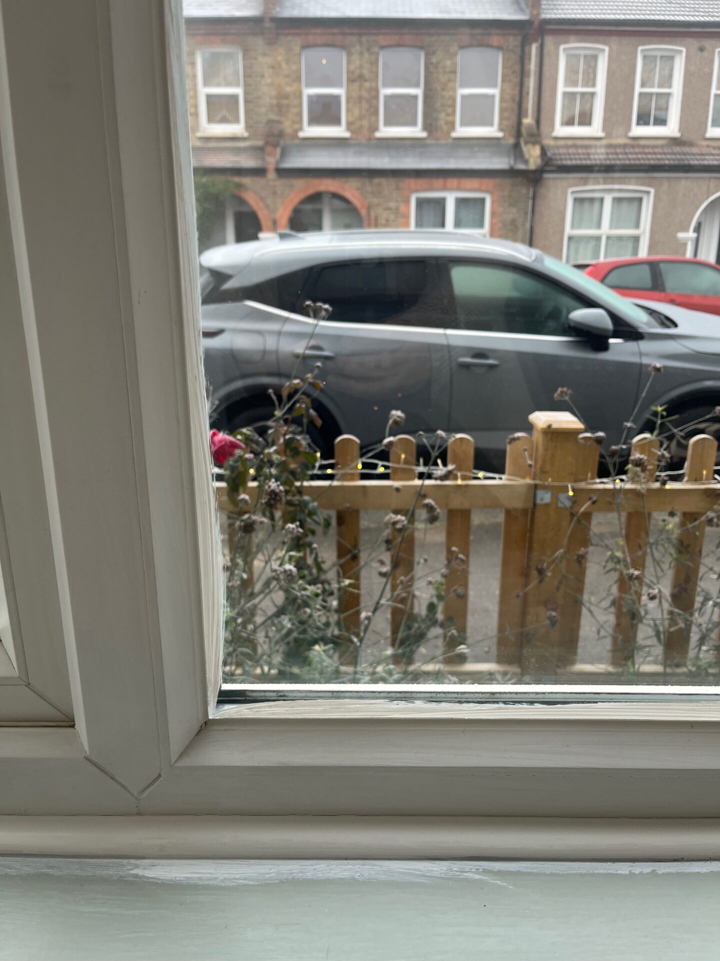
Our loose plan when we bought our small 30s house was to extend the living space (currently one open plan space including the kitchen, dining and sitting room) after five years. The extension will involve going out at the back by around three metres, which will become a dining space allowing us to build the kitchen into the current dining space and close off the sitting room. As we approach that five year mark the mortgage climate and cost of living has made this project unfeasible for now so I decided just before Christmas to invest some time and a small amount of money into decorating the space instead, something we’ve never really done because in the back of our minds it has seemed like a waste of energy with a big extension on the horizon.

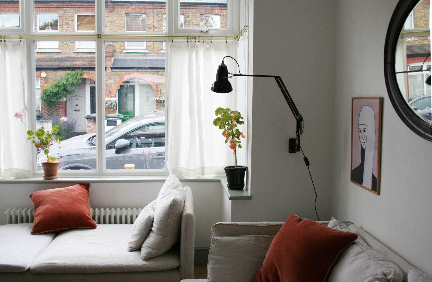
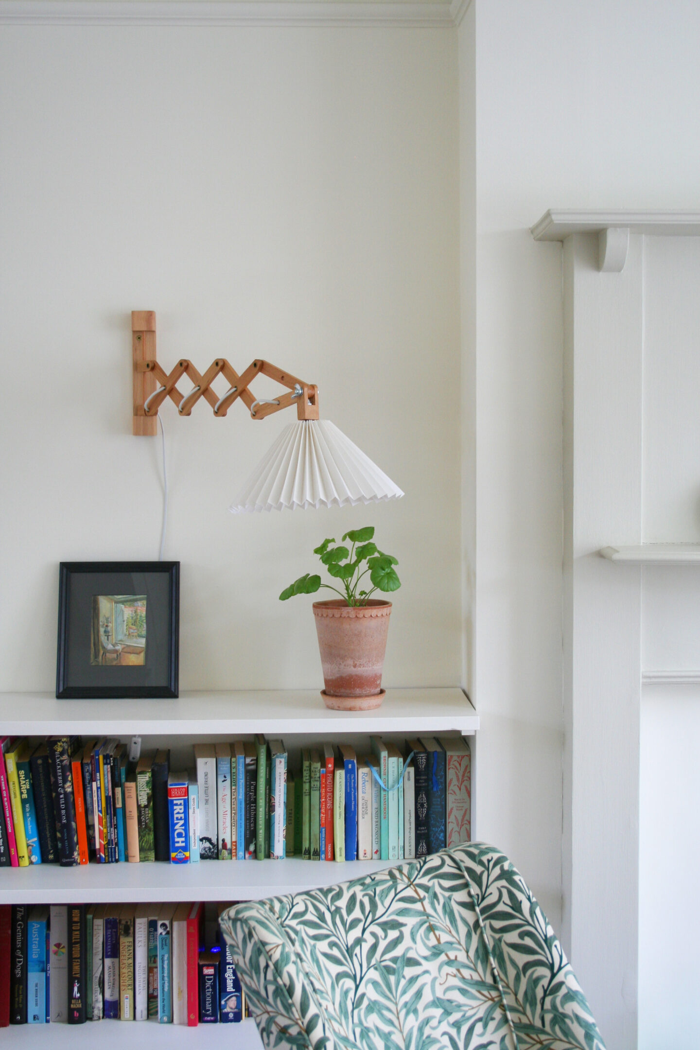
My first priority was to paint the space. I was tempted to go bold but knowing myself and the fact that this is the only living space we have I knew warm neutrals was the way to go to blot out the cold drab brilliant white. It may not look hugely different in photographs BUT it makes the world of difference in how the room feels and how well furniture and artwork sits against the walls.

Walls and ceiling: Bookstore | Fire surround: Cafe Flore – COAT paints

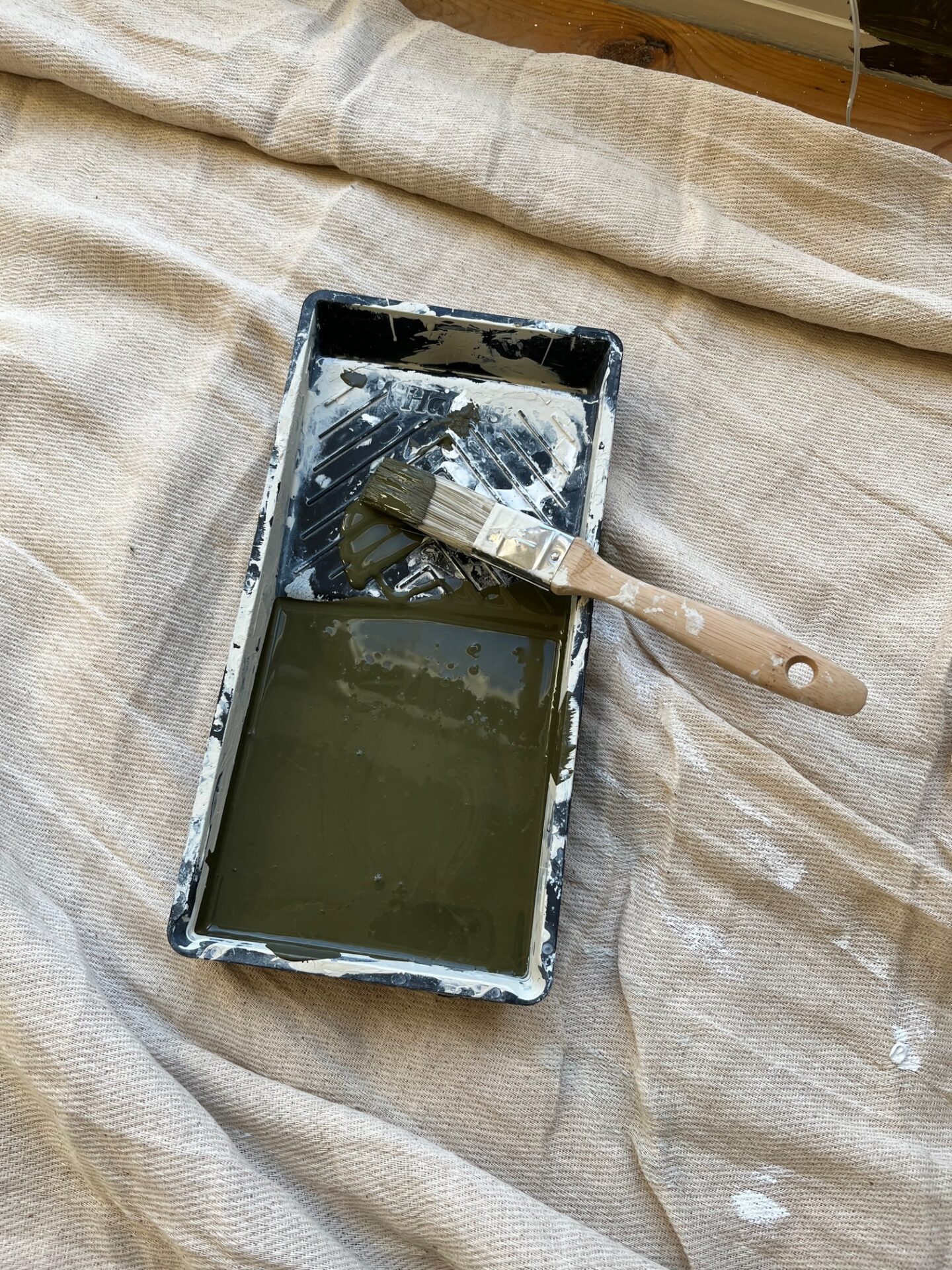
I started the big painting project at the start of December knowing I had four weeks off college and no work until January. What was I thinking?!! Imagine the Christmas fun I could have had instead of painting in every spare moment! Anyhoo, it was all worth it for the difference it has made. I chose COAT paint* having worked with them on a previous collaboration so I know how good the coverage is and the company’s eco-credentials. I’m also very keen on how tough and durable the matt eggshell is as our house takes a beating being so small and having a big dog and a young child. I have already scrubbed the walls and skirting down after mud shaken all over them and they came up good as new.

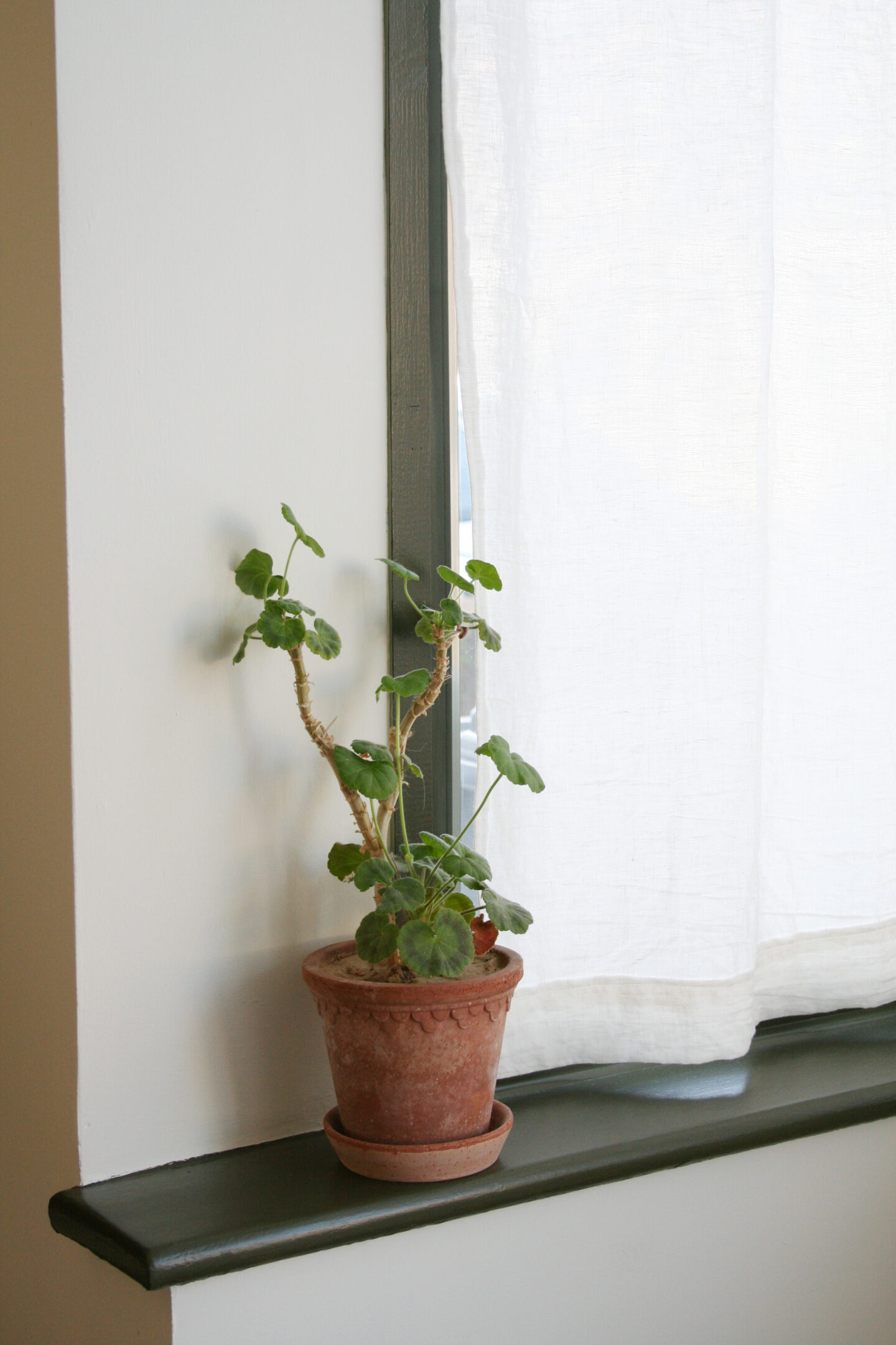
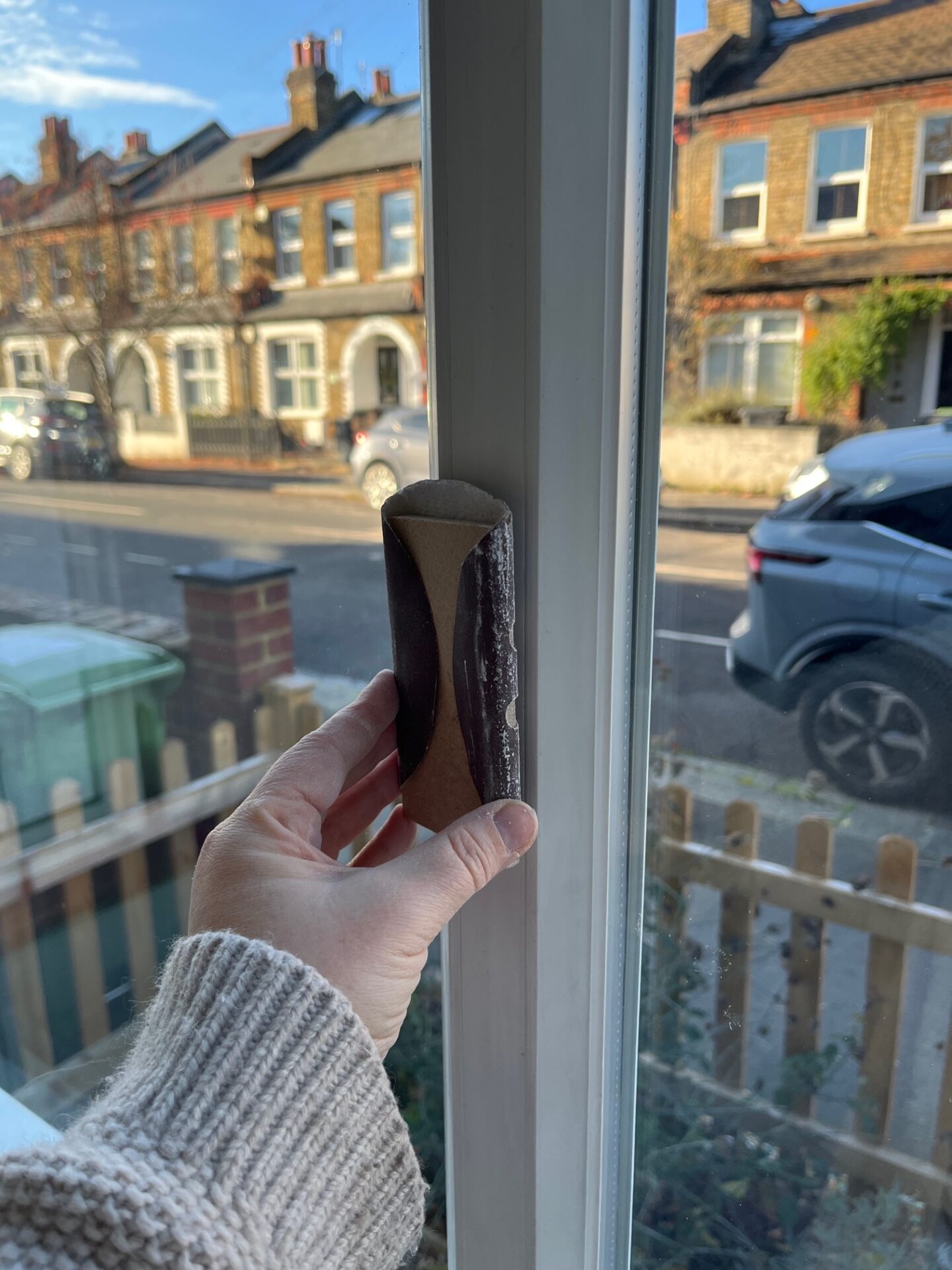
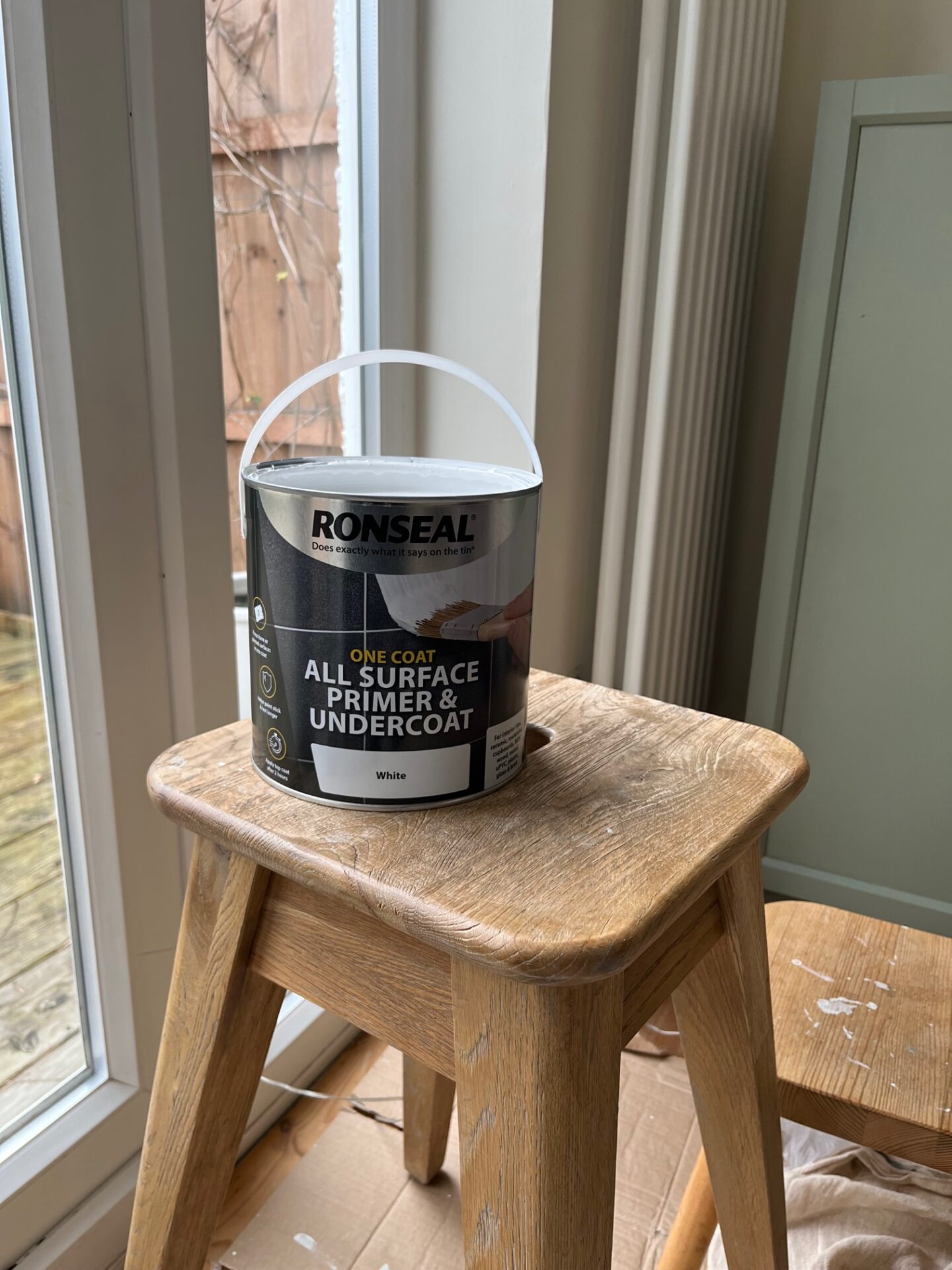
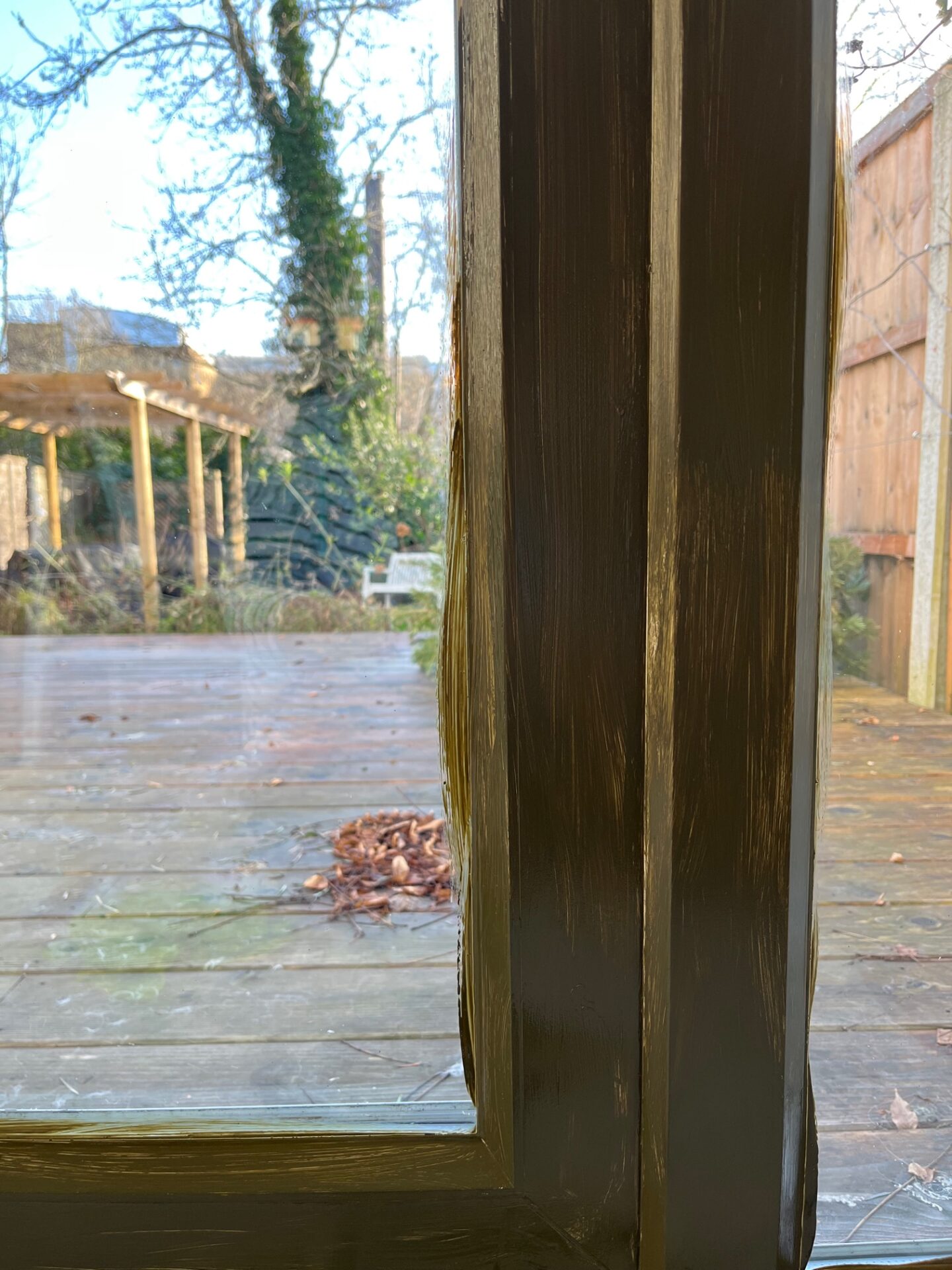
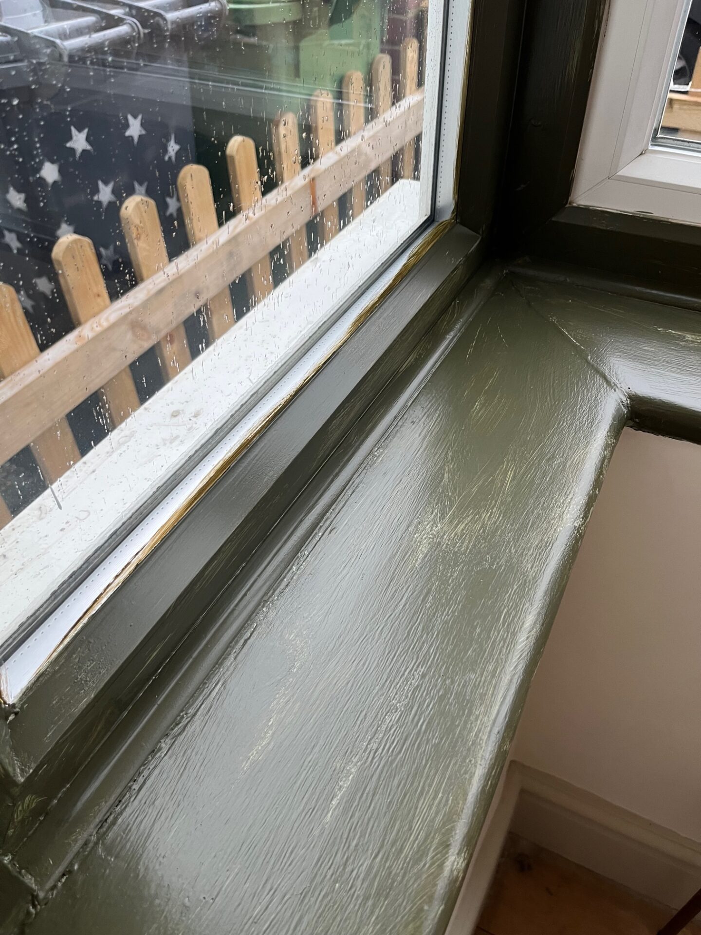
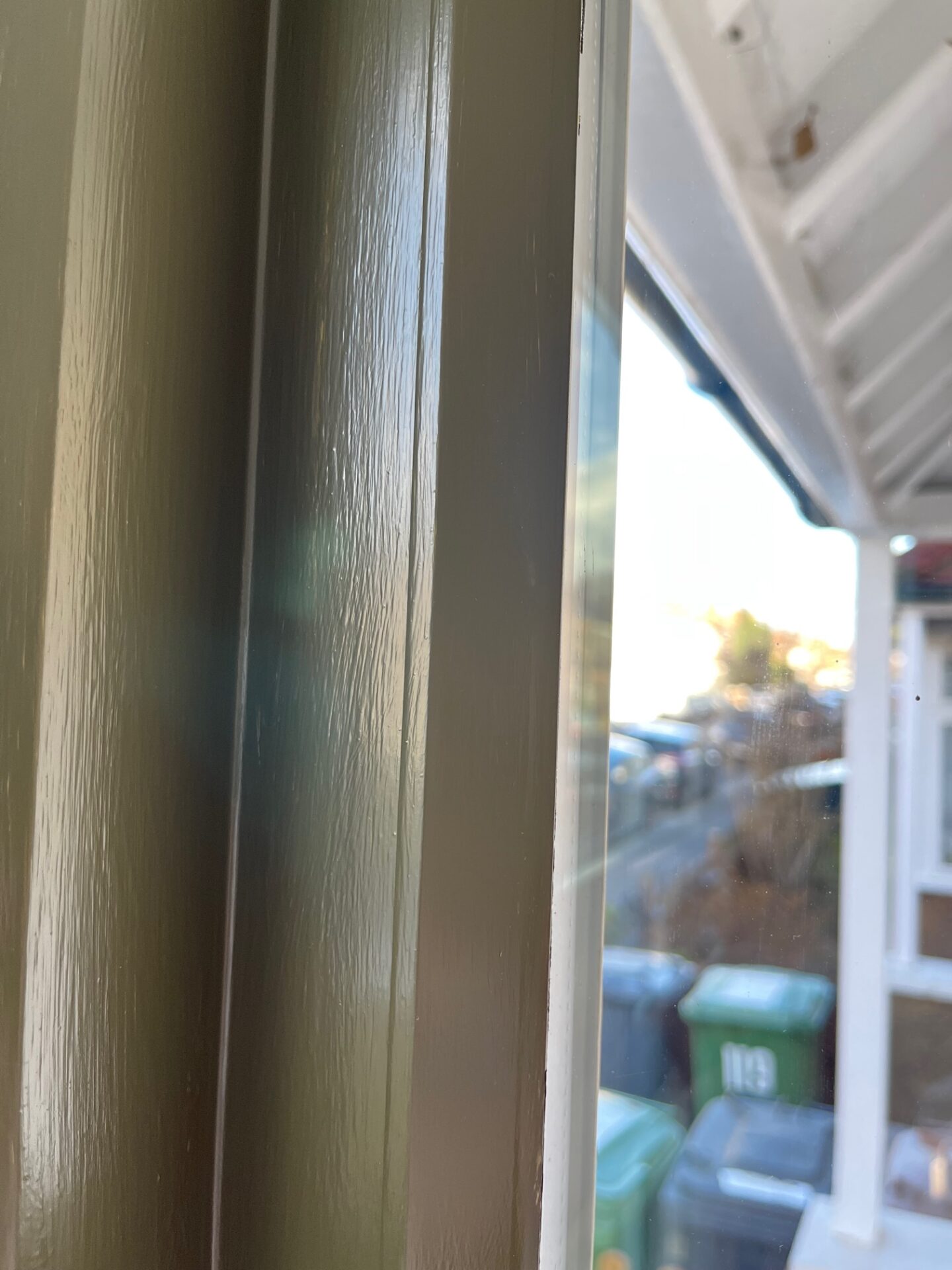
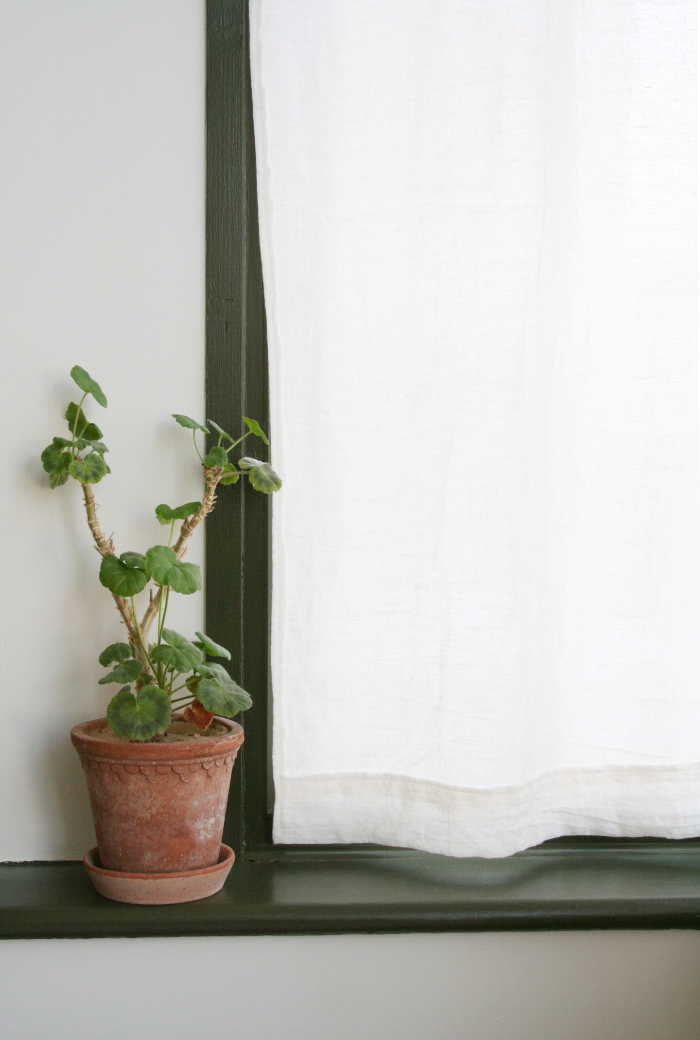
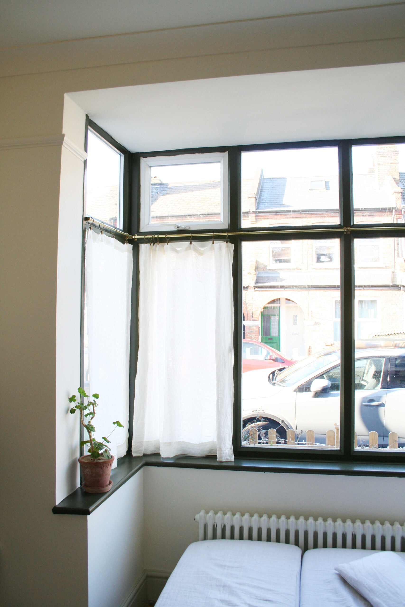
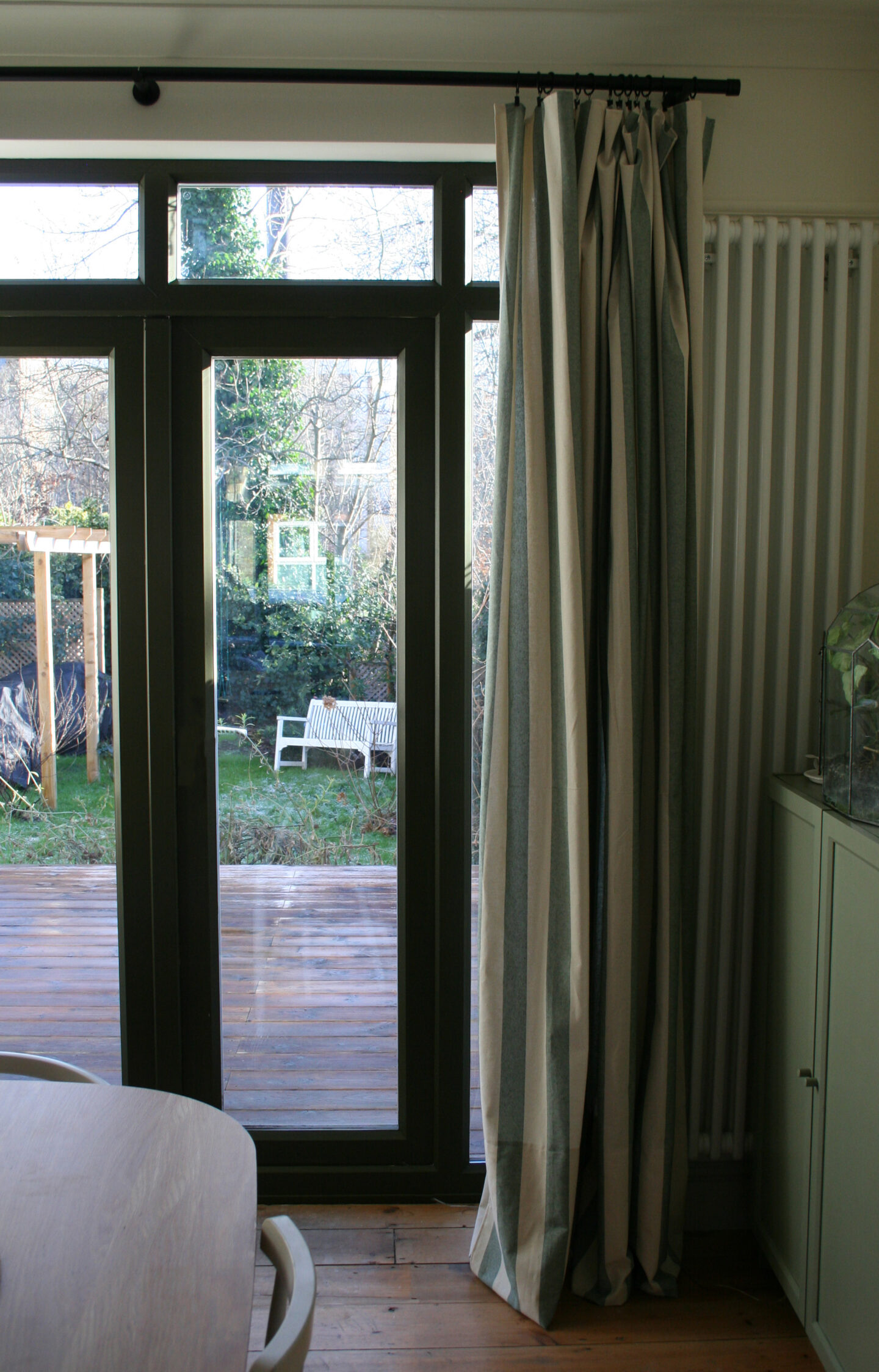
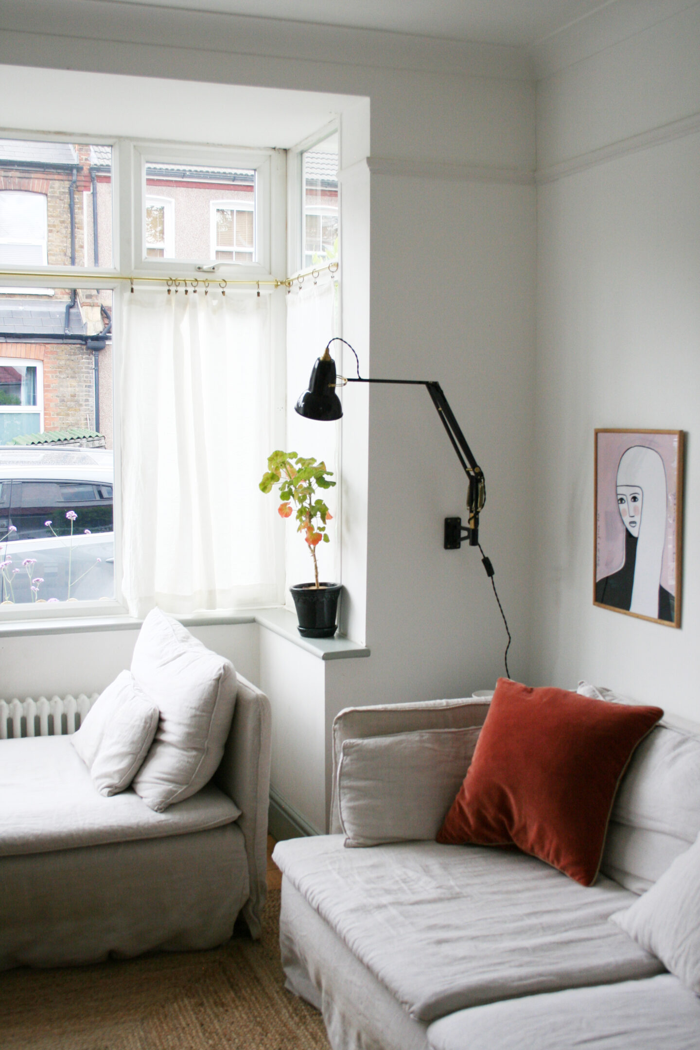
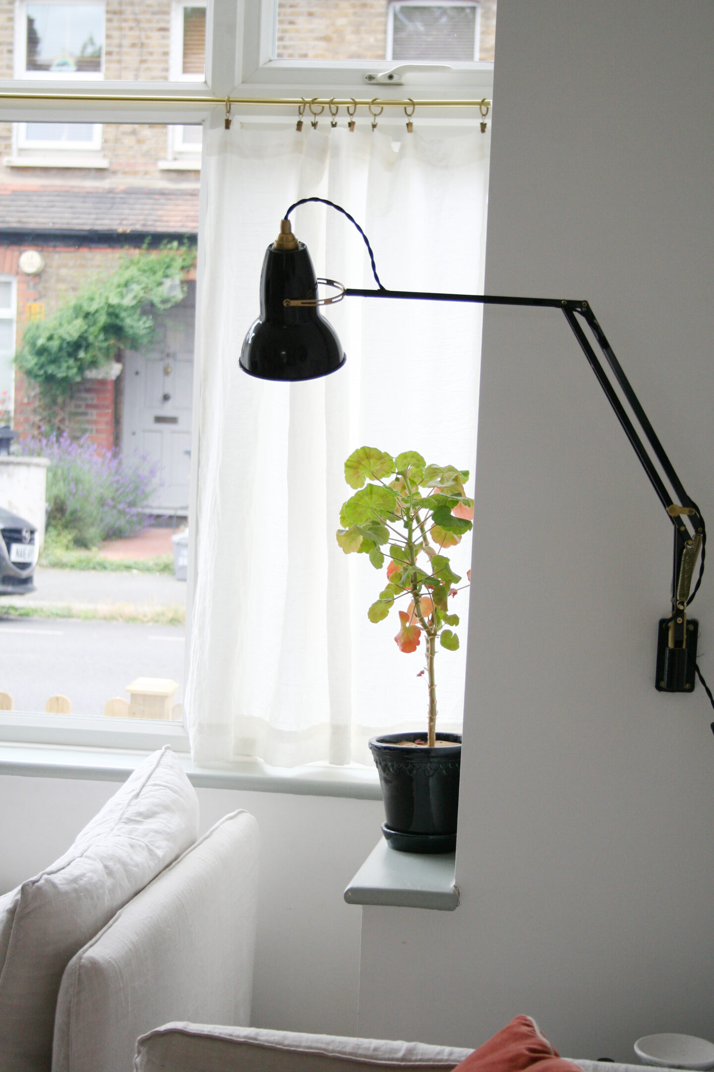
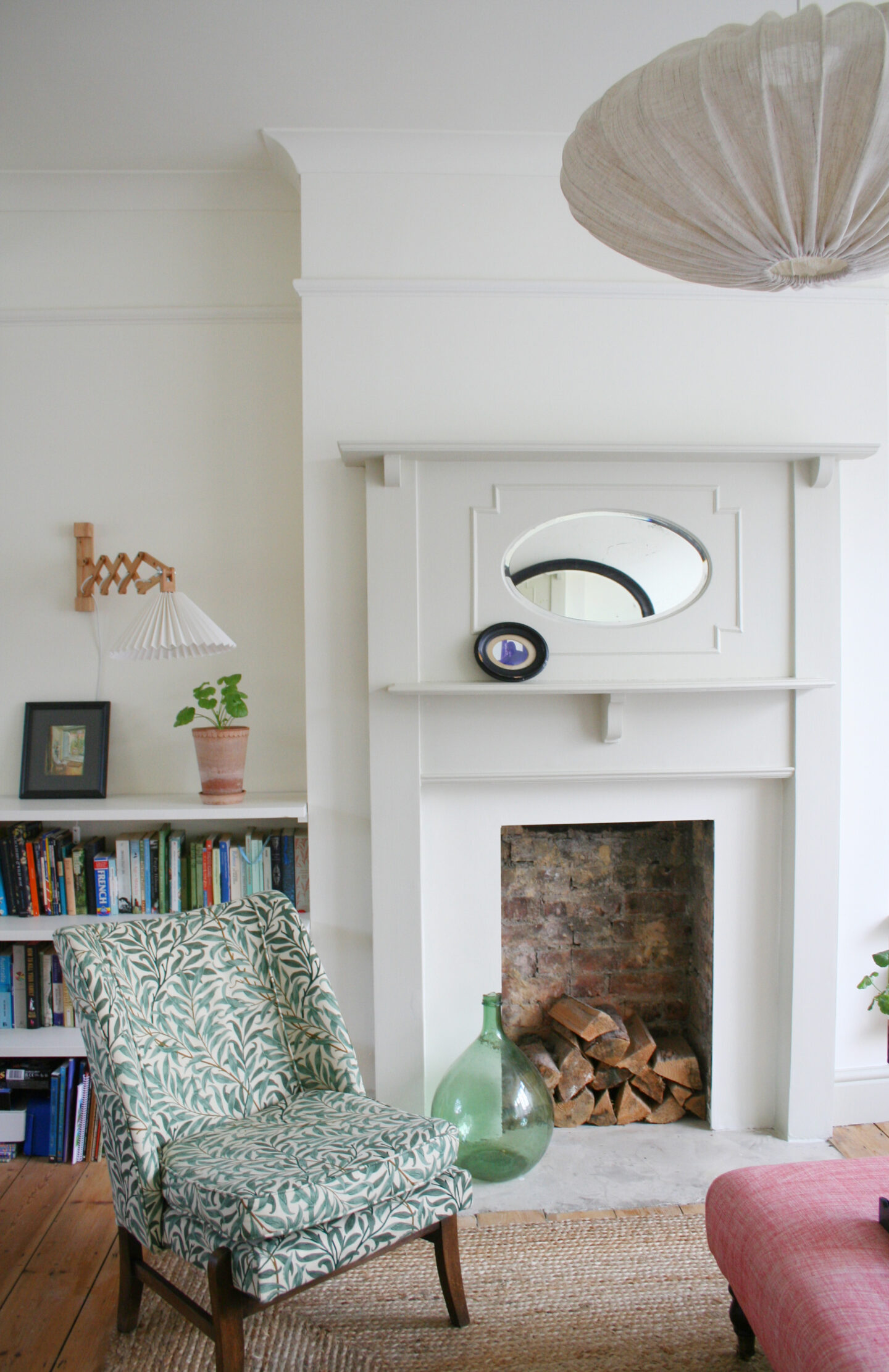
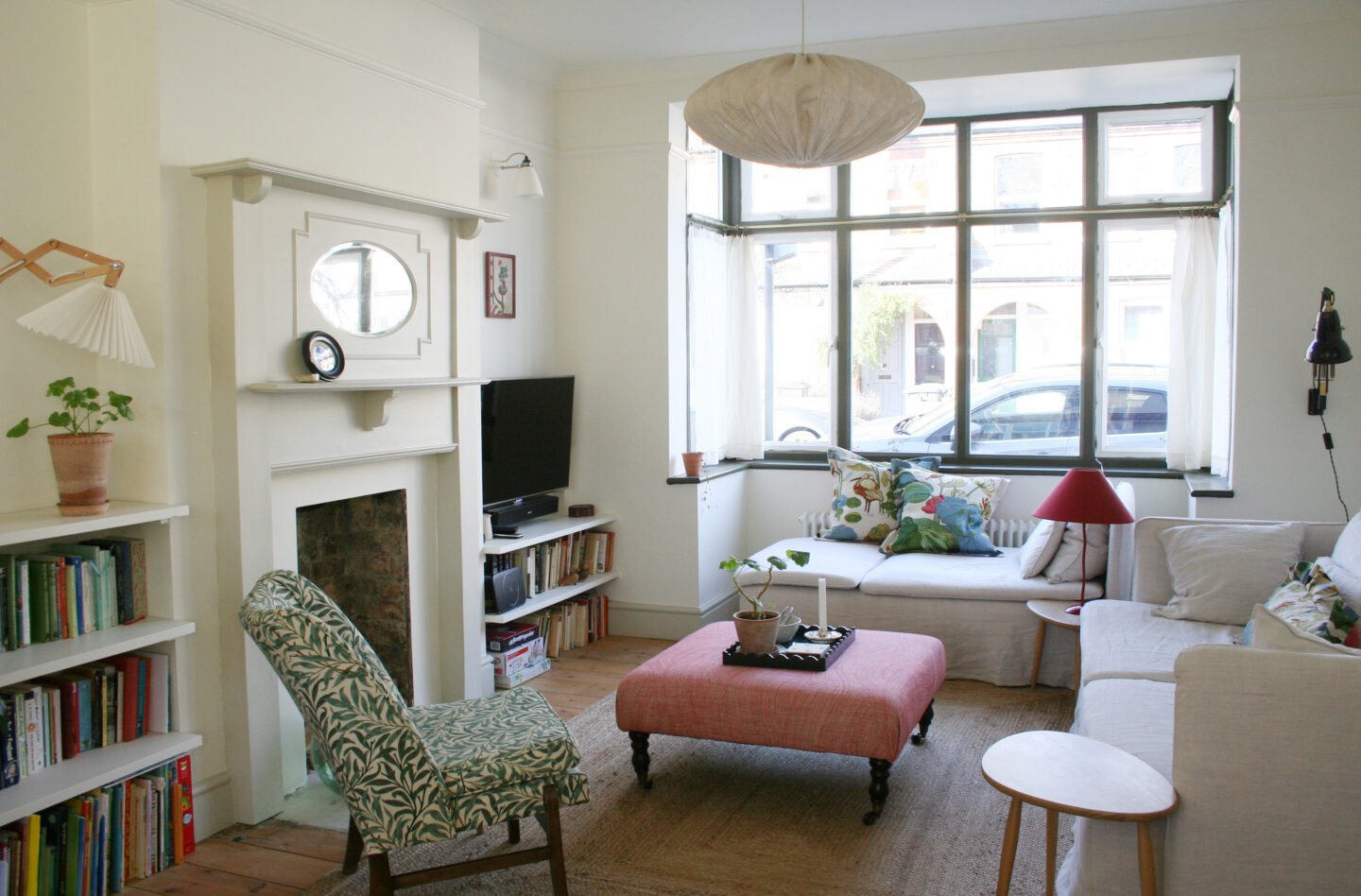
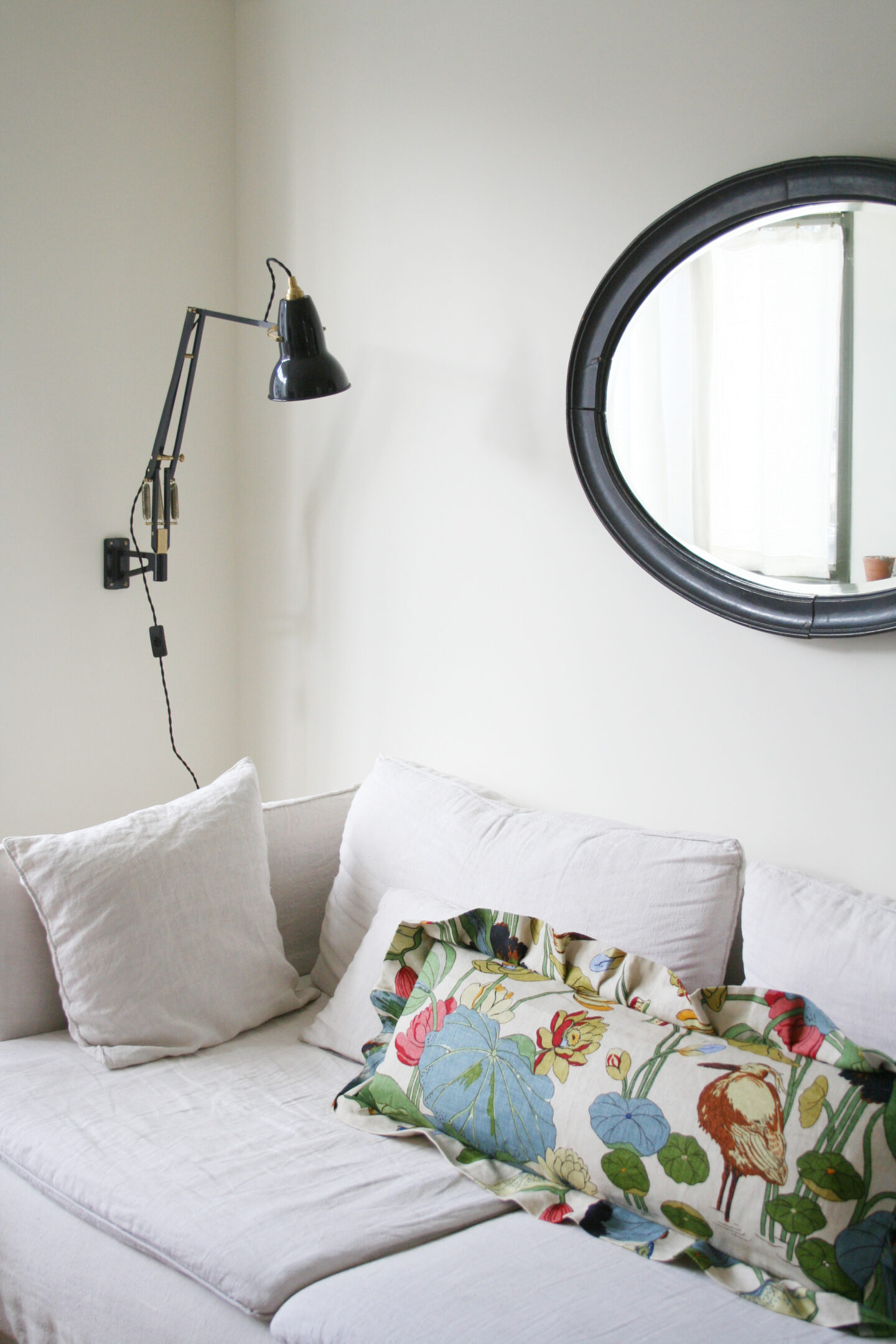
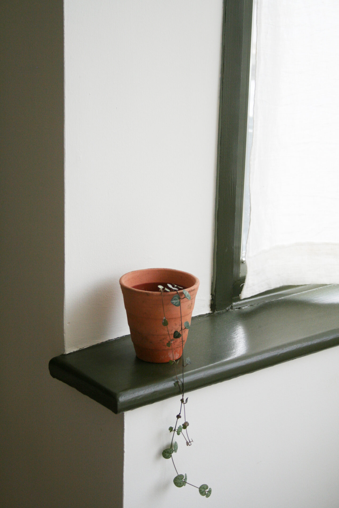
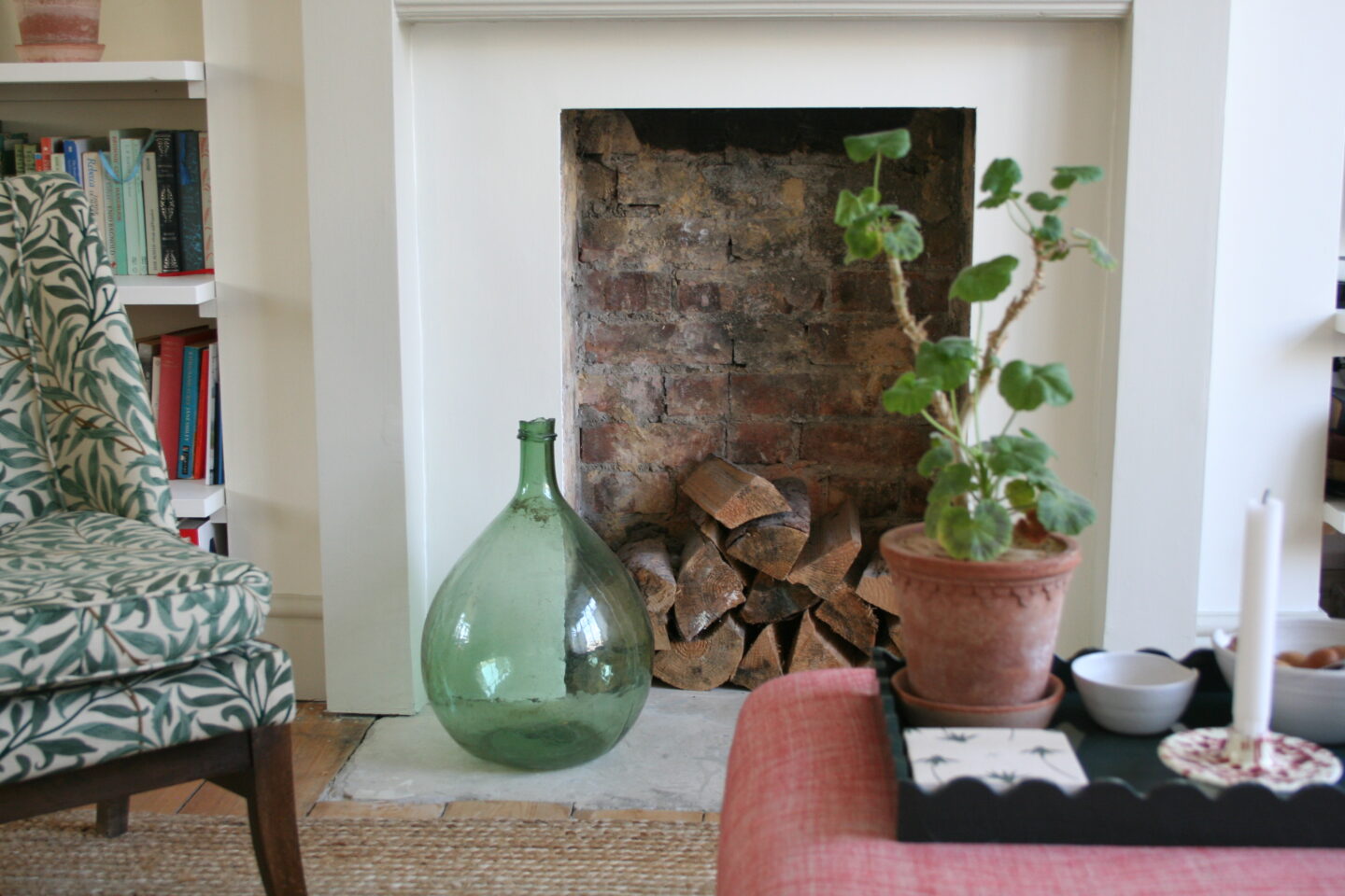
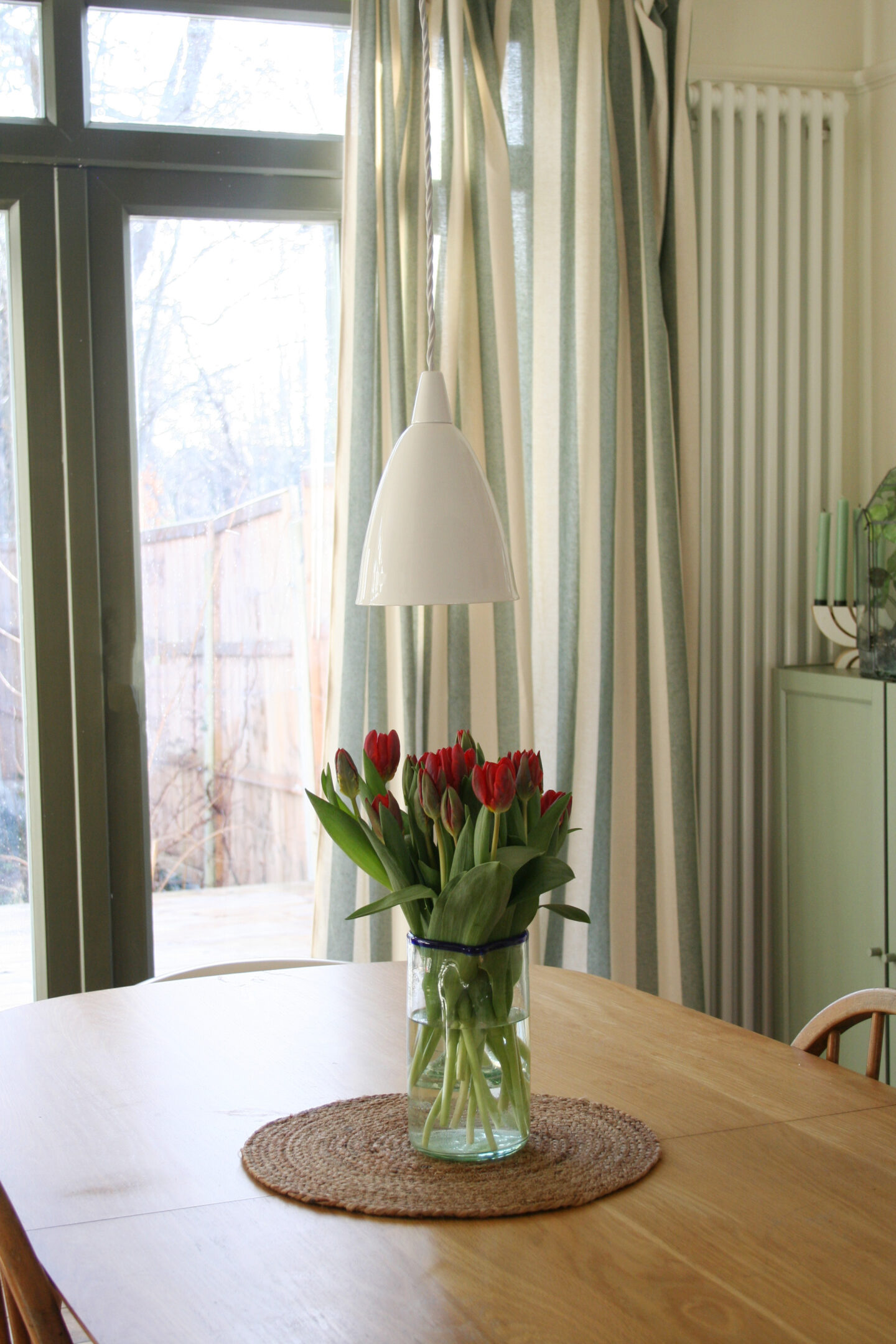
I’ve loved seeing the transformation of Laura Jackson’s home using her Paris-inspired collection of paints with COAT so I chose Bookstore for the walls – a clean but warm yellow-based white – Cafe Flore for the woodwork and fireplace – a richer unctuous green-based neutral – and The Tobacconist for the uPVC window and door frames – a very dark bronze green.

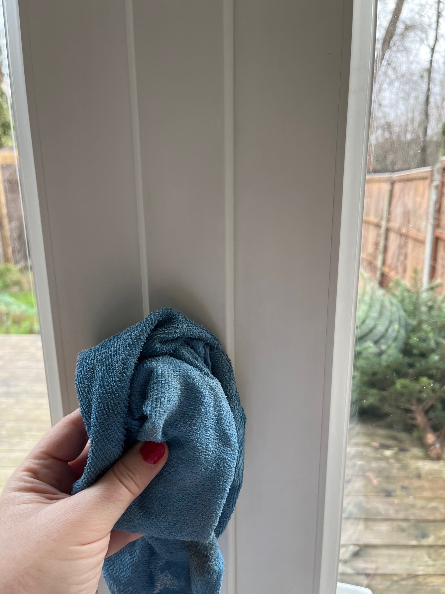
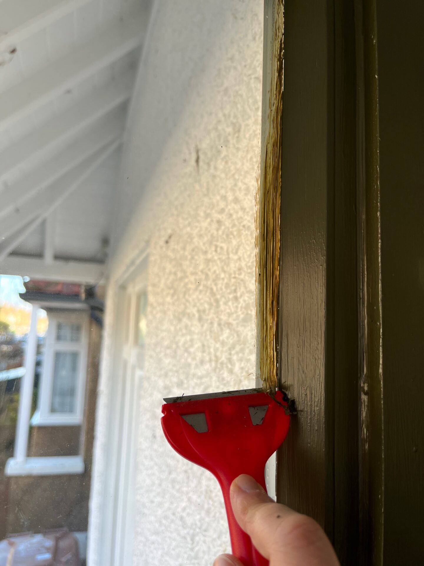
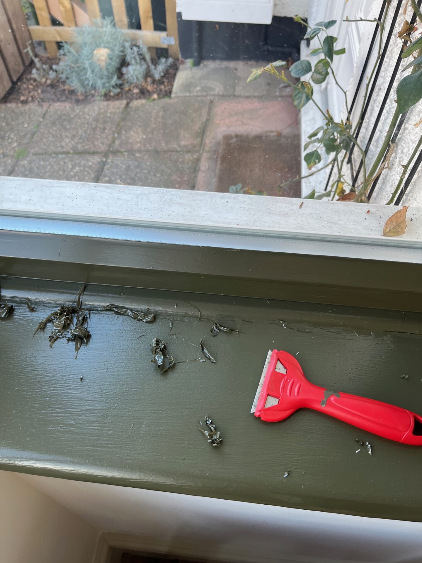
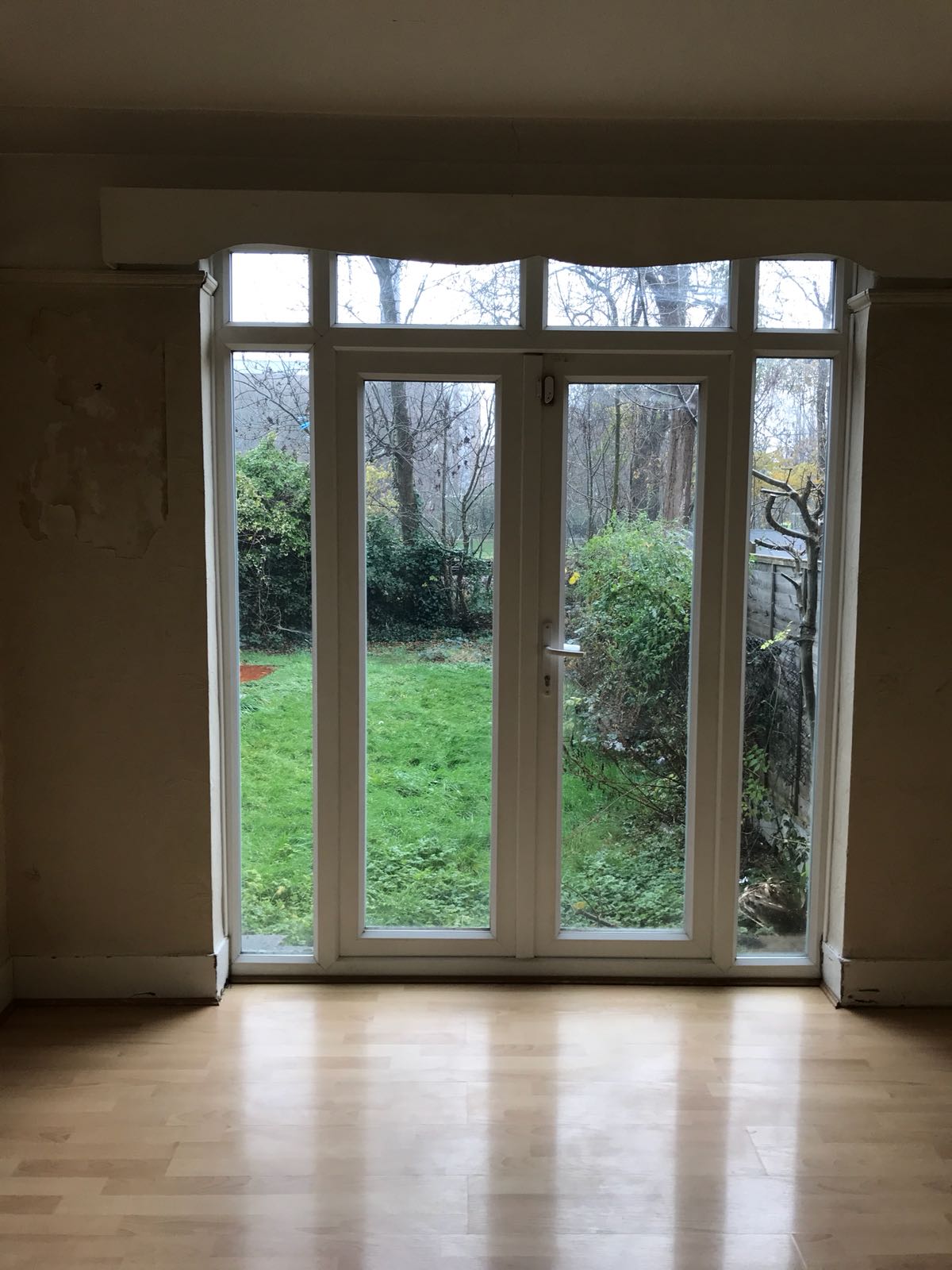
If you want more info about how I painted the uPVC frames do read this post Painting internal uPVC window frames. Friends that have come round since I’ve painted the frames have honestly thought I’ve had new windows and doors put in – painting them dark is so effective.

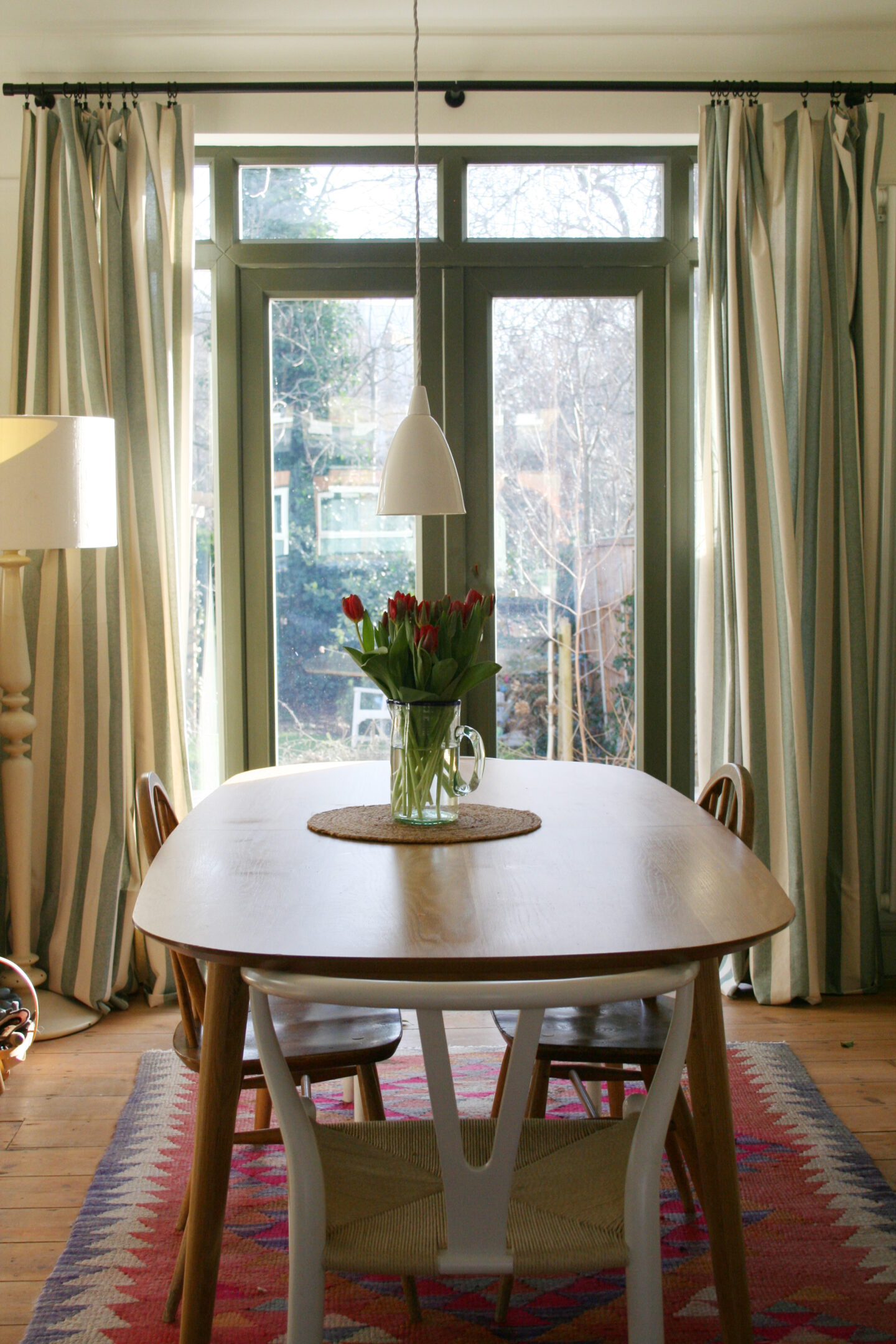
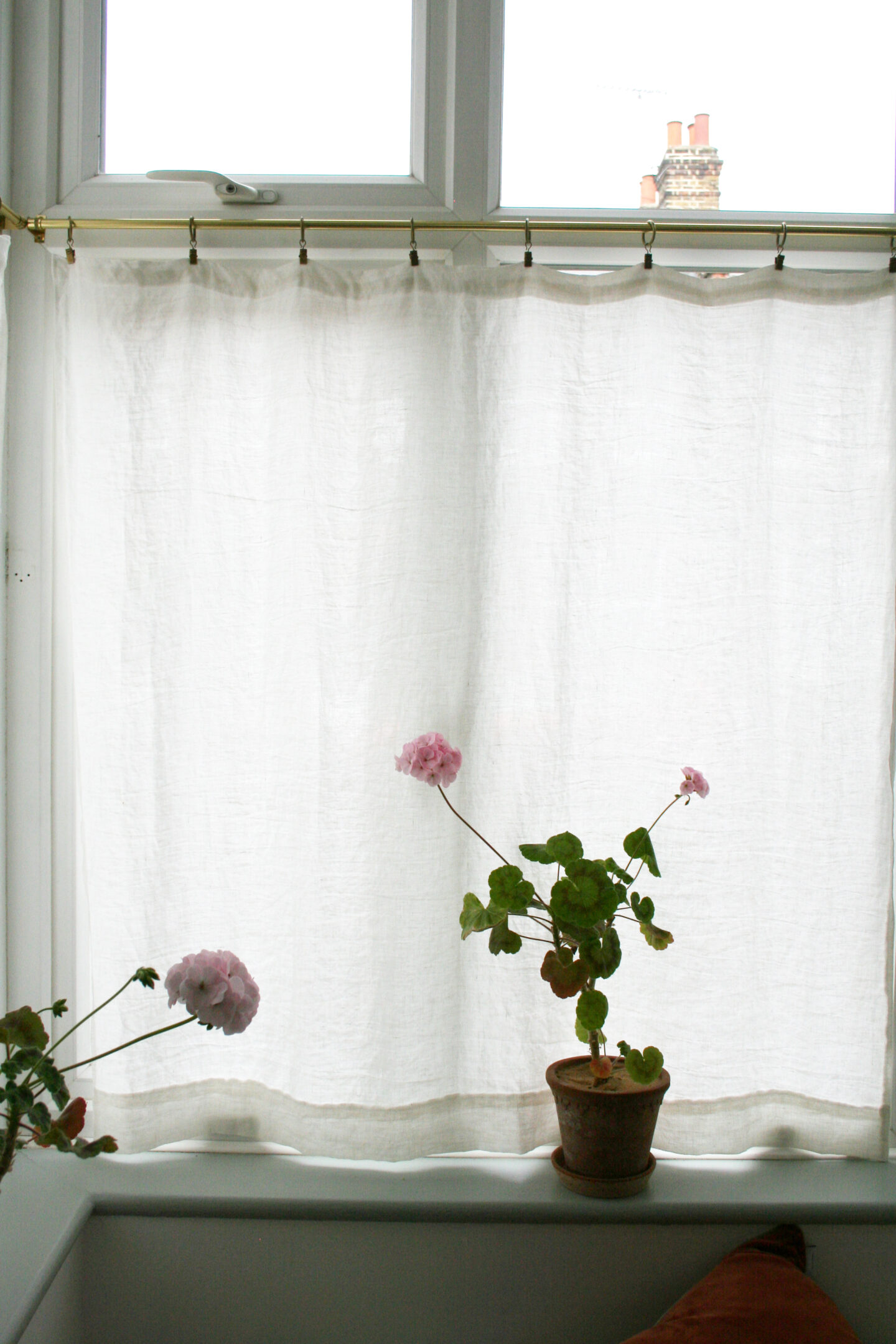
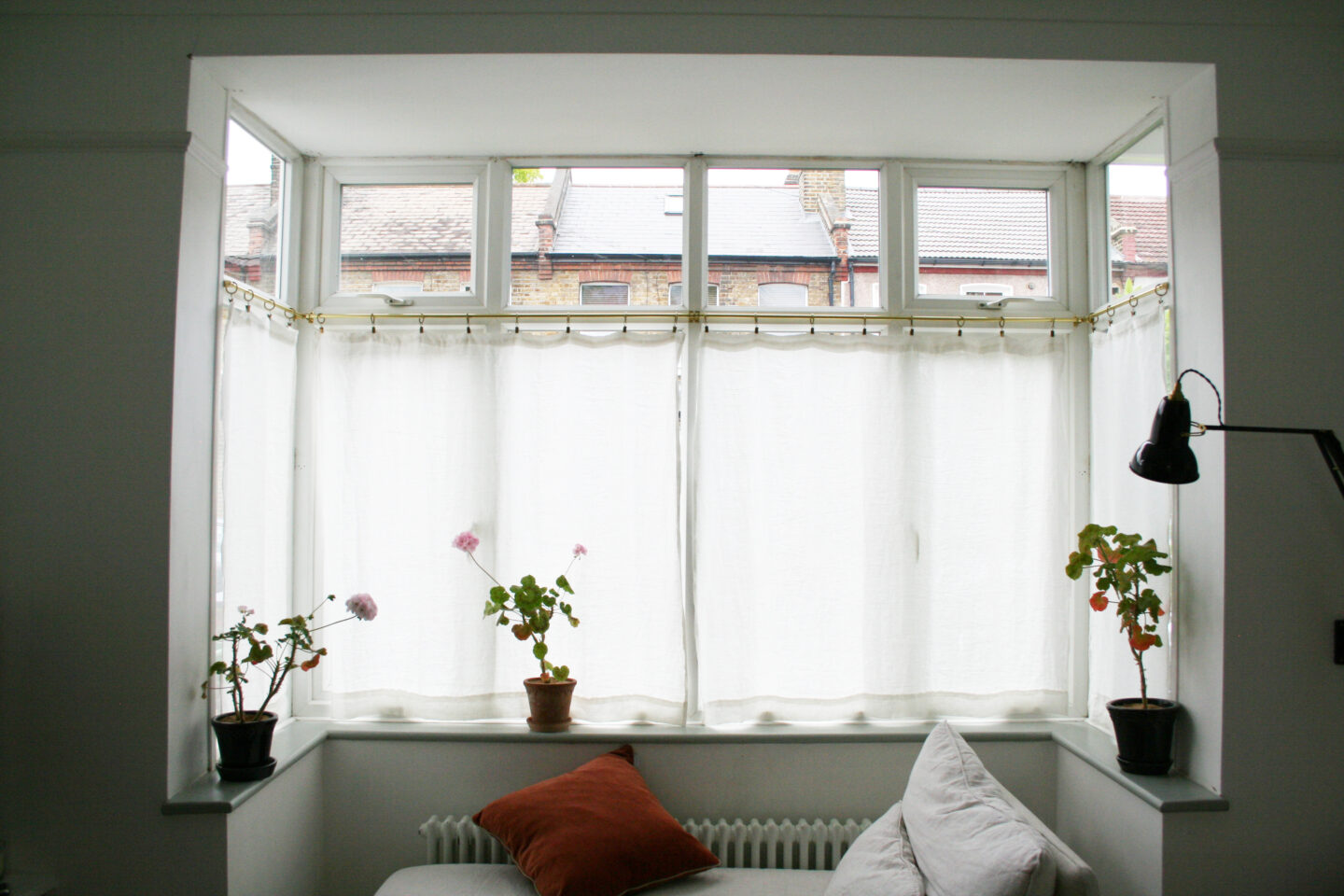
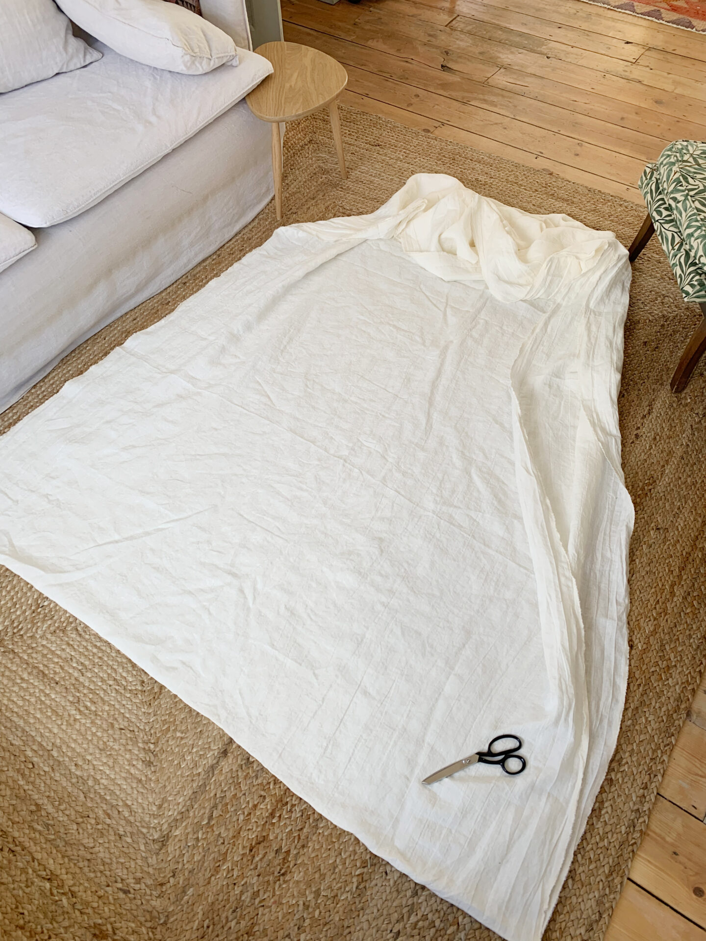
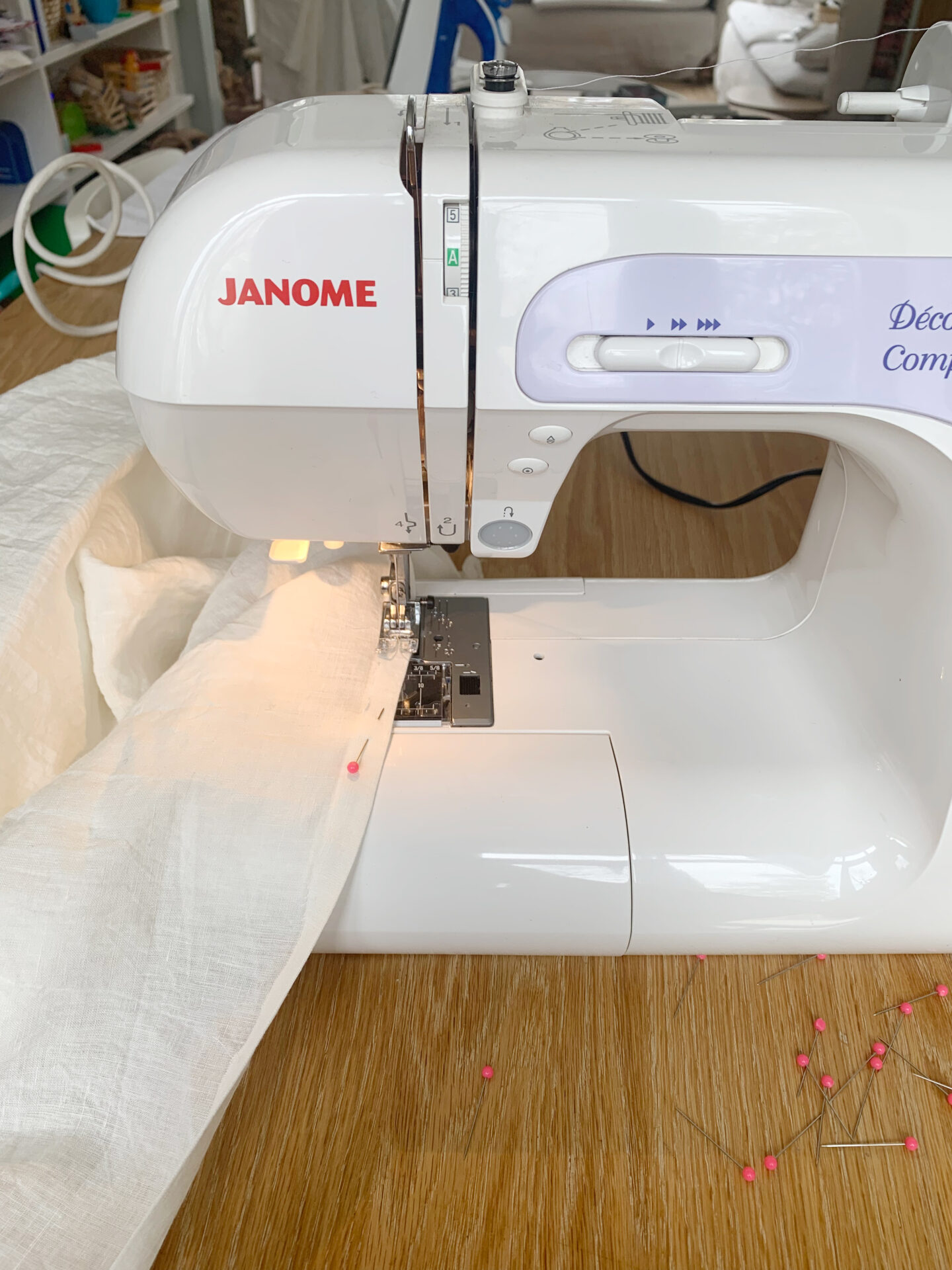
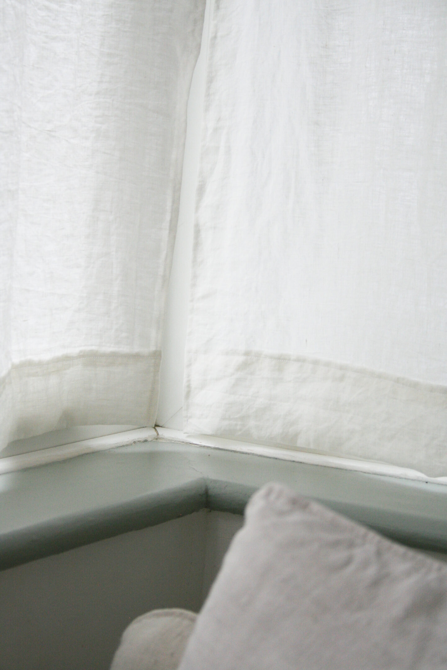
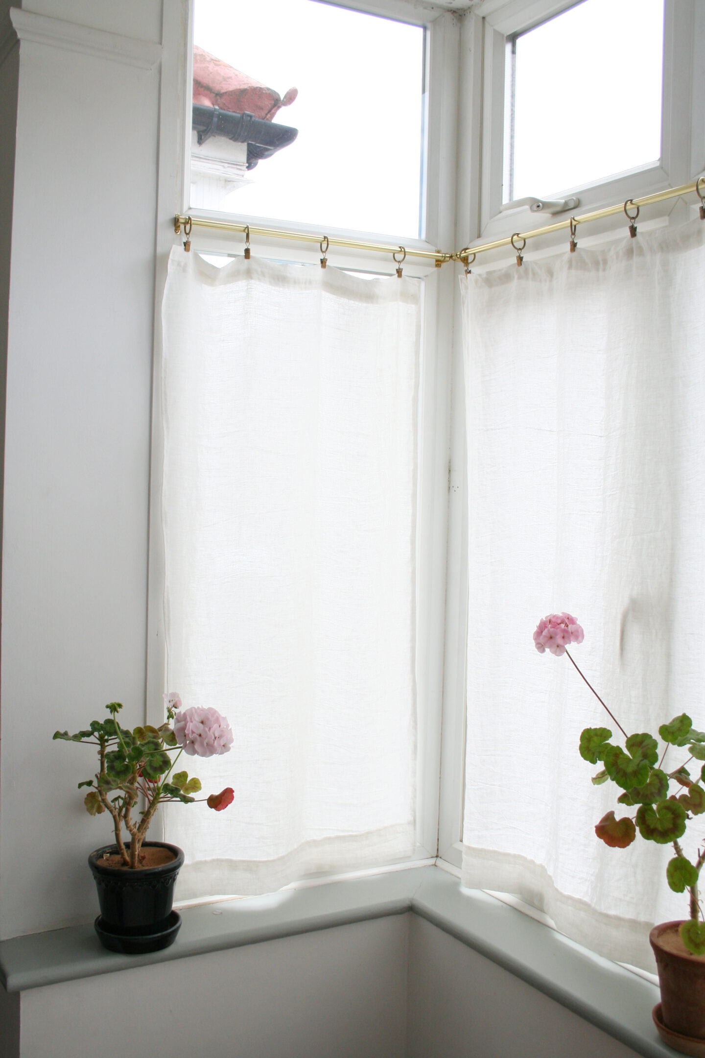
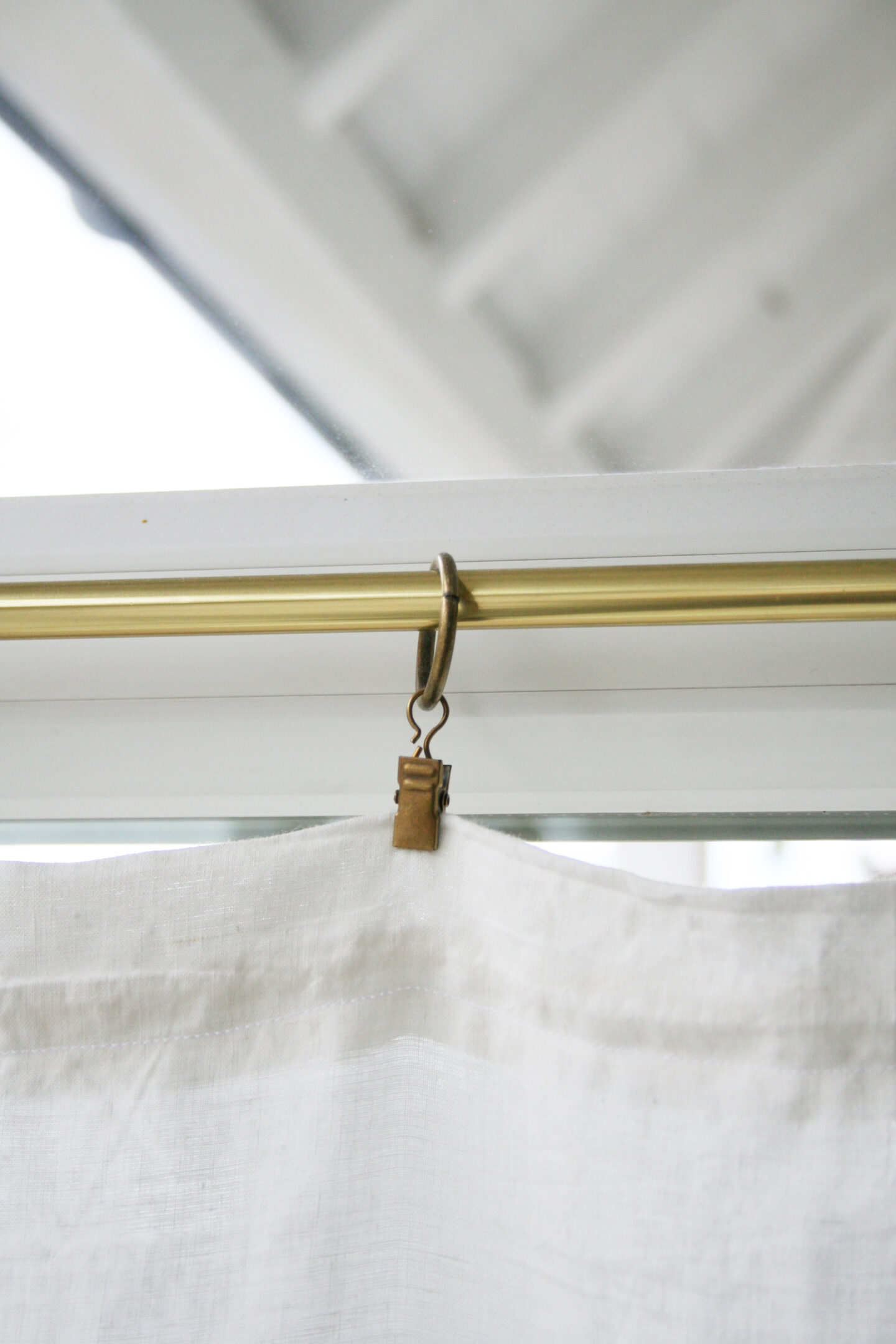
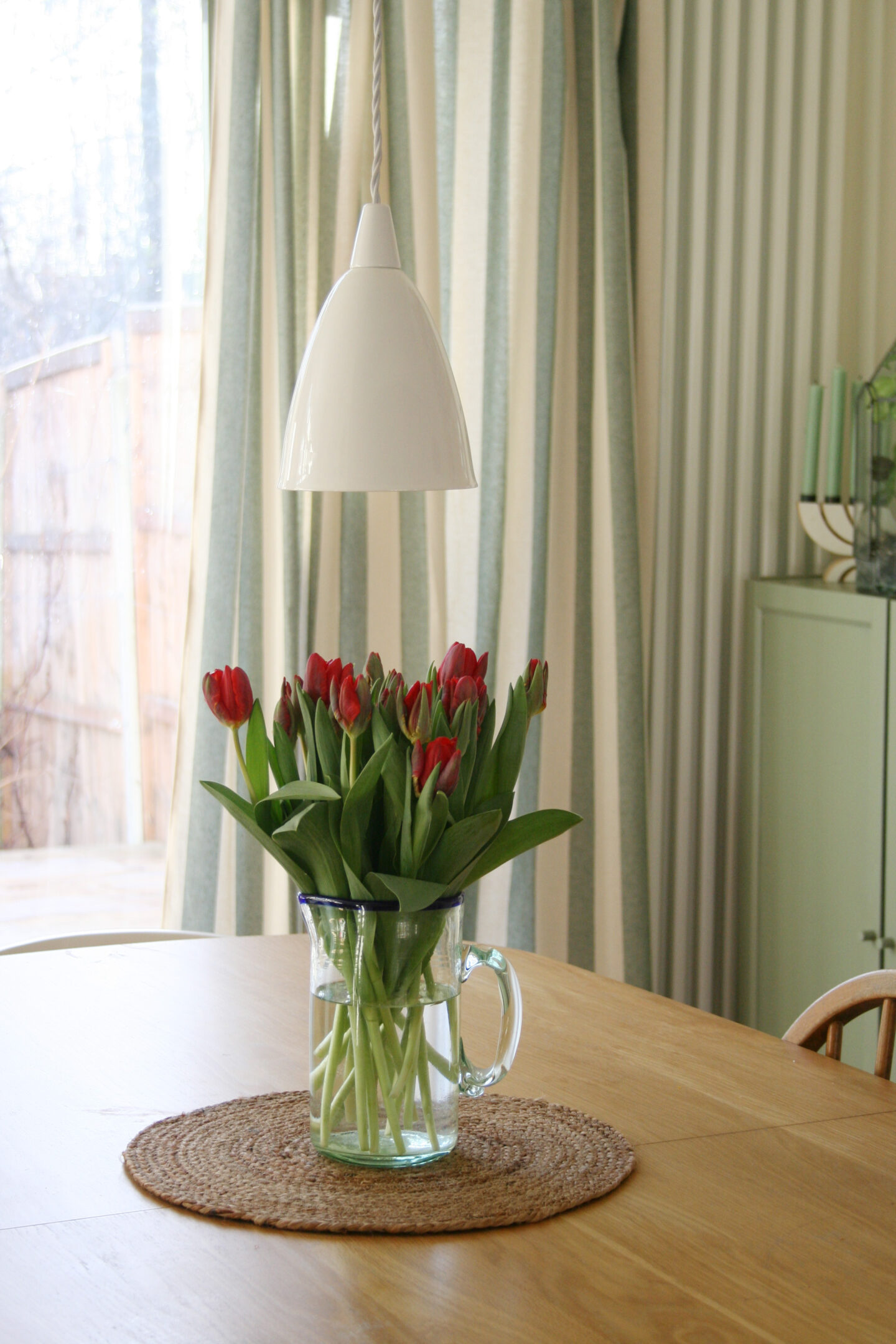
Once the painting was complete (well, almost – I still have a couple of window frames to do when it’s warm enough to open them all day to allow the paint to dry) I turned my attention to adding some beautiful textiles. I didn’t want to change any of the furniture as there is nothing wrong with it but we have never invested in curtains, blinds, cushions, lampshades etc. I decided to make a big set of curtains for the French doors to the garden as it’s always been unpleasant having naked glass at night time and not only does it draw attention away from the uPVC frames it adds such a big volume of fabric to the space that makes it feel so much cosier and less echoey! I chose vertical stripes as this also makes the ceiling feel higher. I will a separate post about how I made the curtains but they’re not quite finished yet as they’re currently hanging on clips so I still need to sew in the curtain header and then hang them on rings.

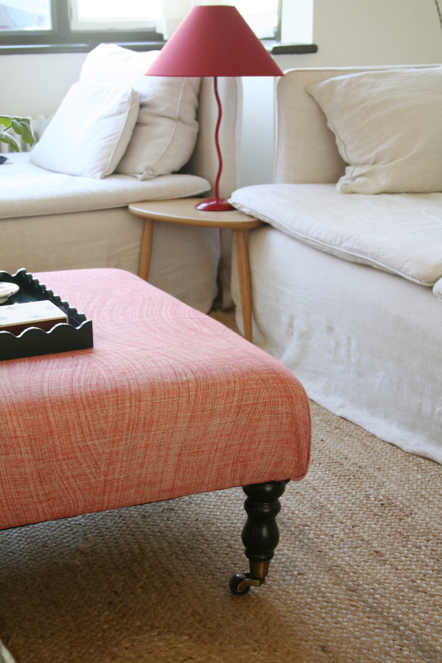
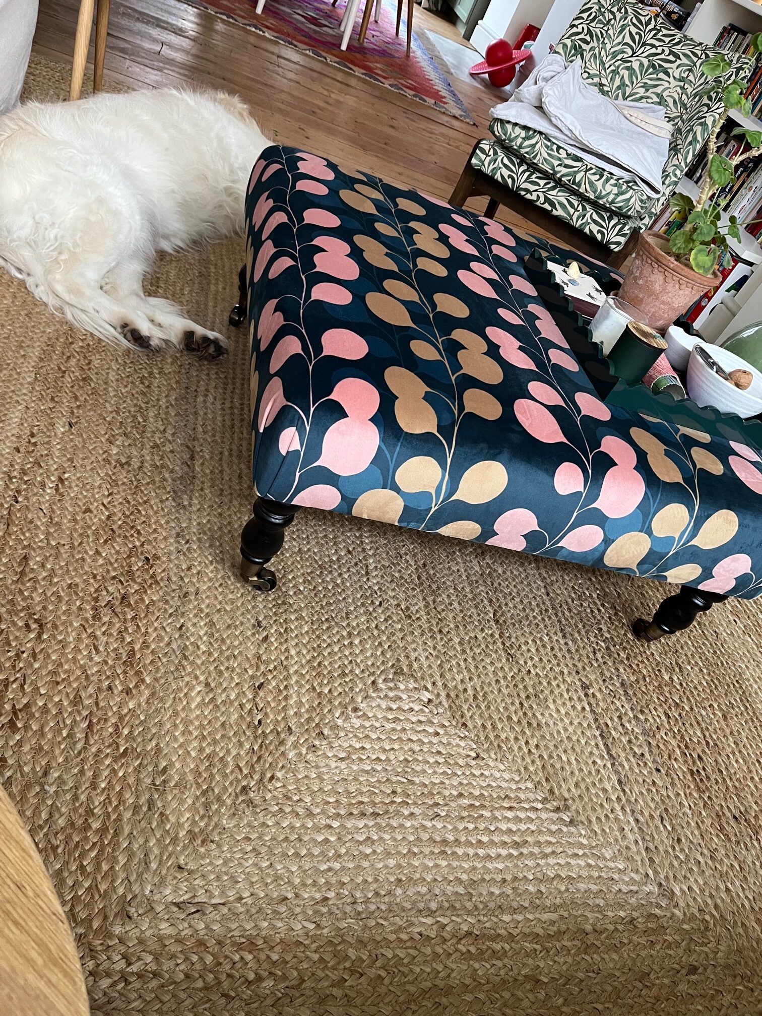
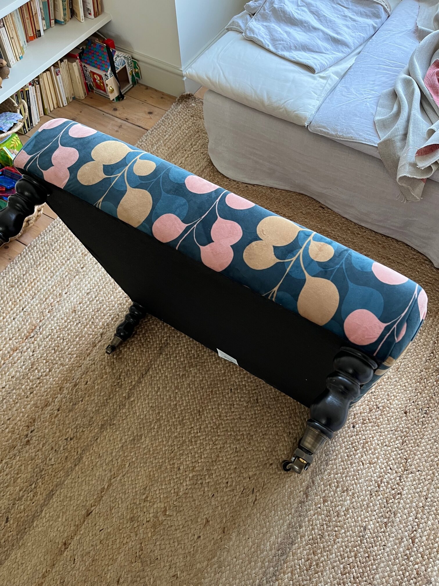
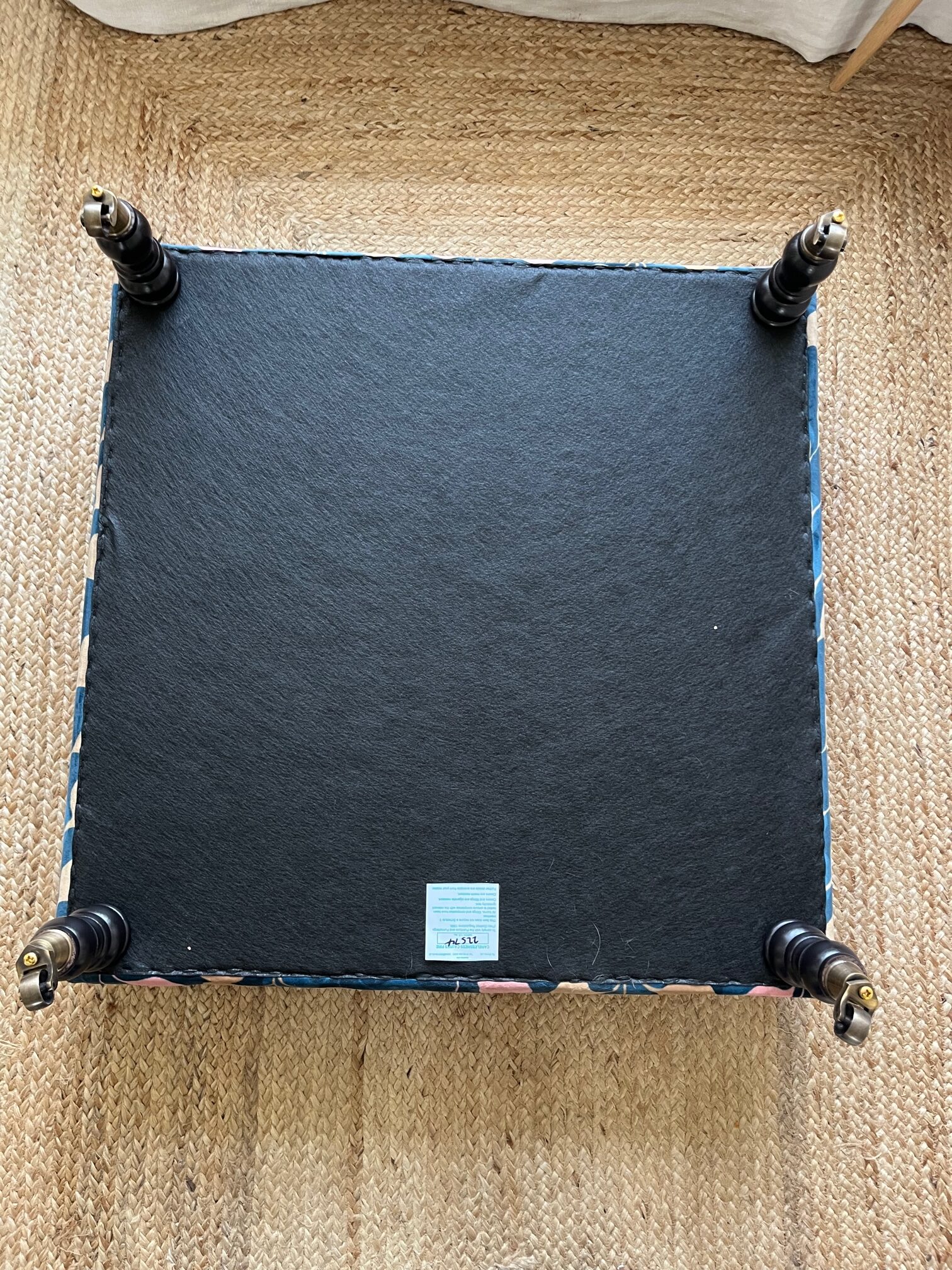
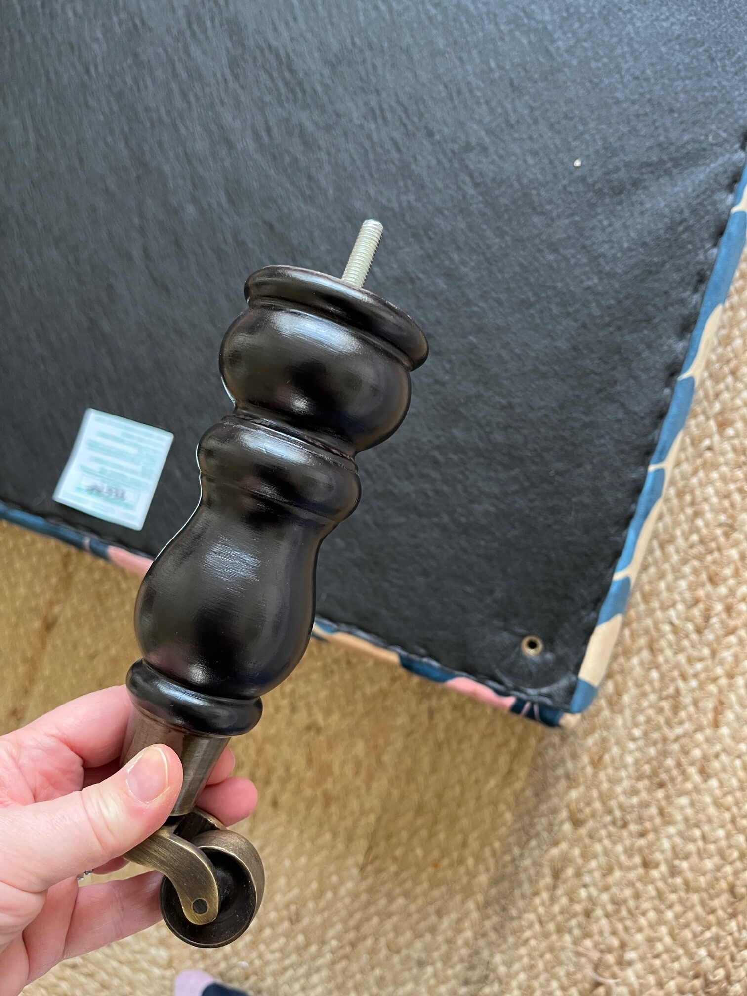
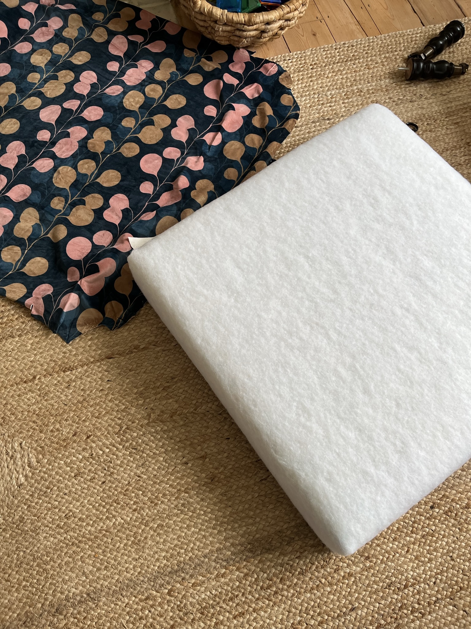
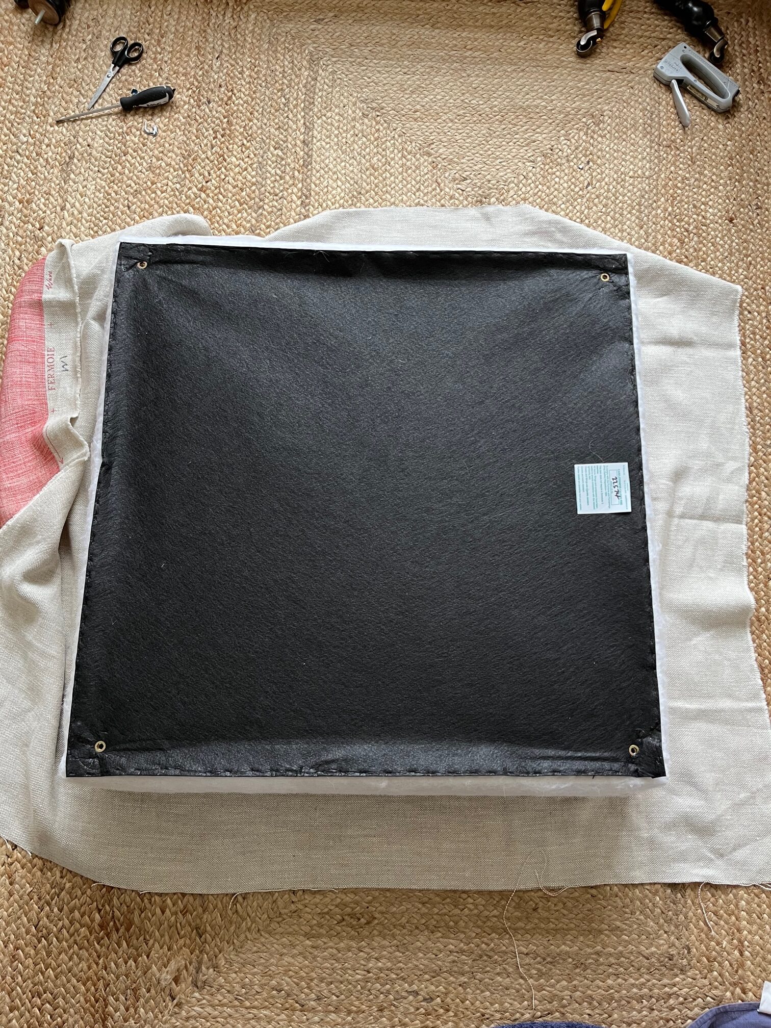
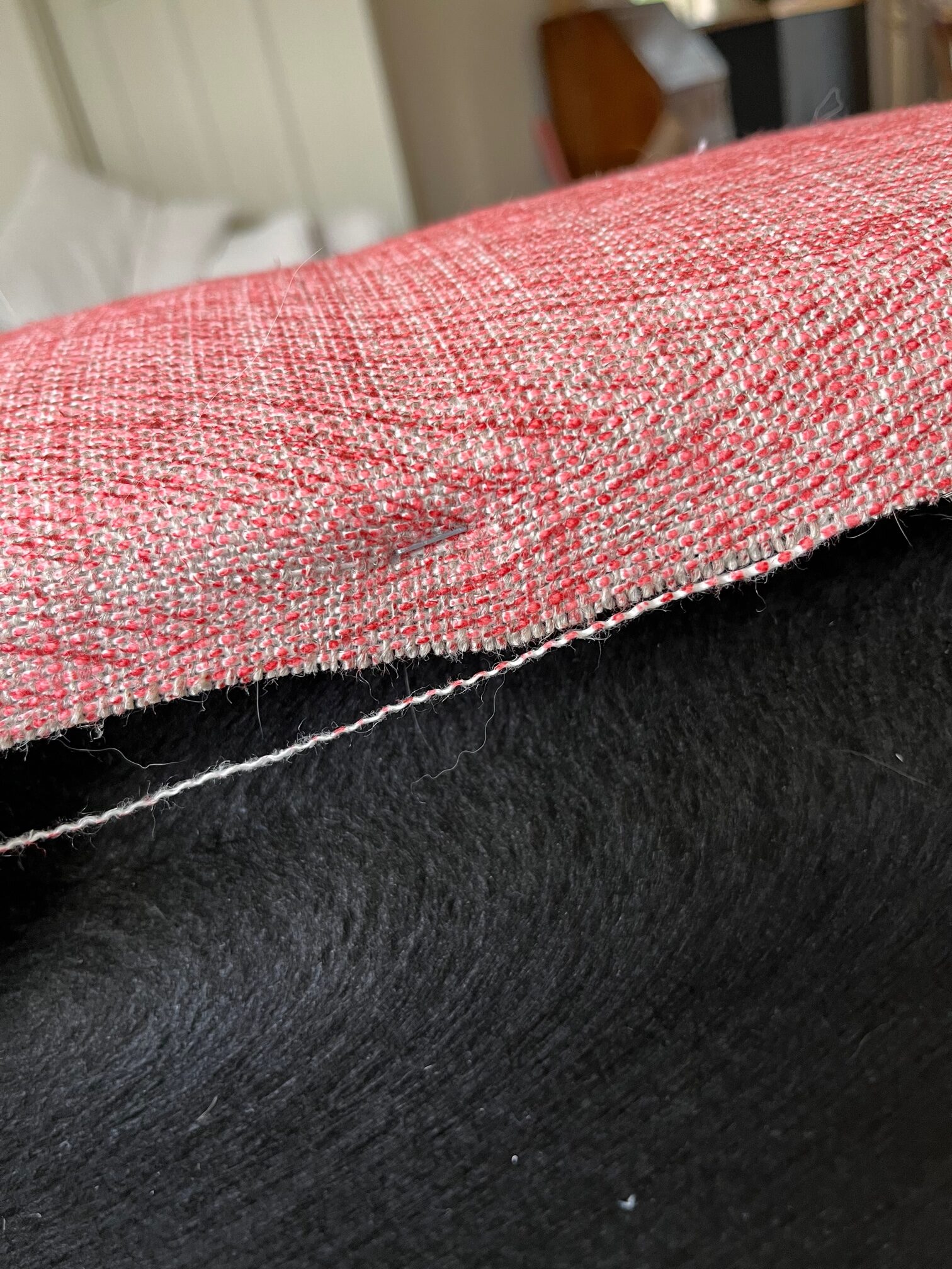
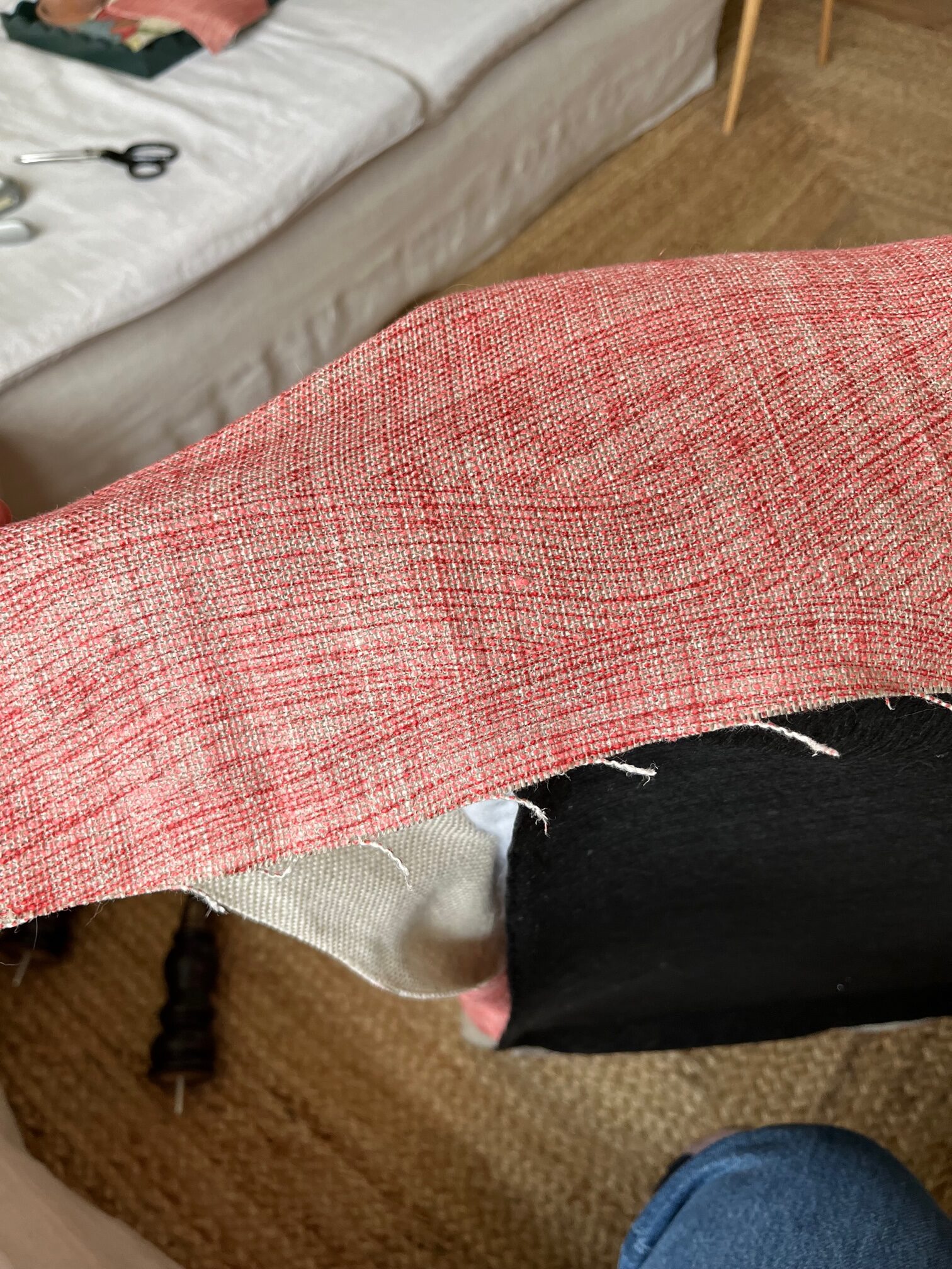
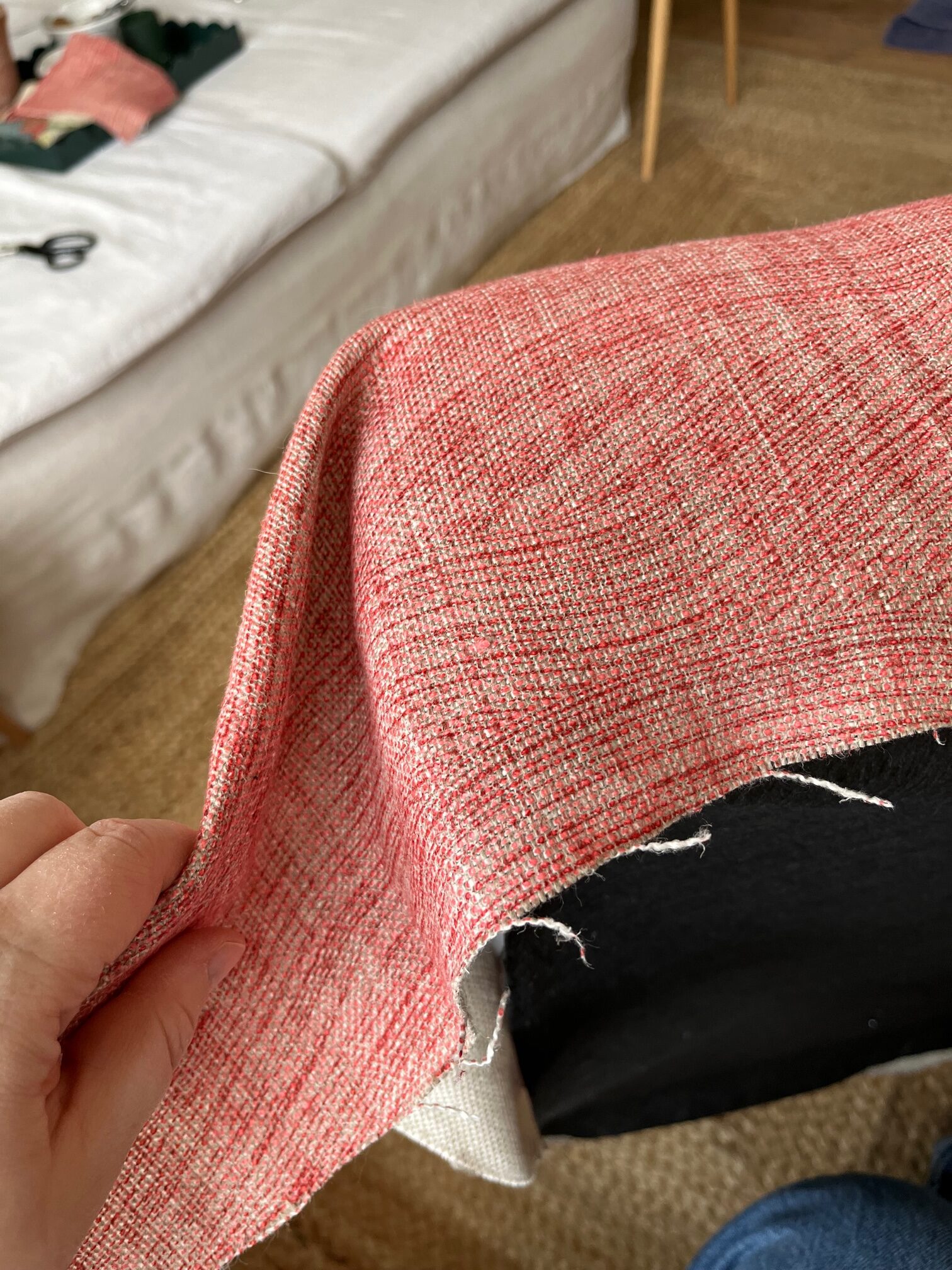
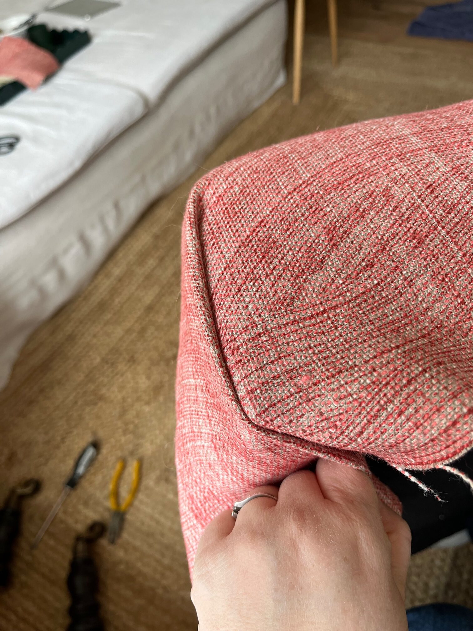
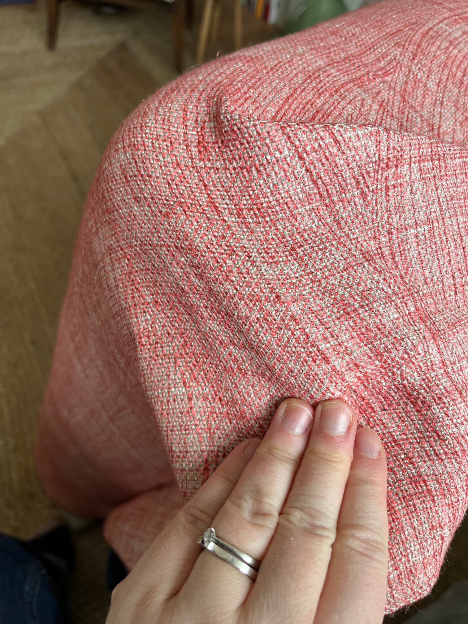
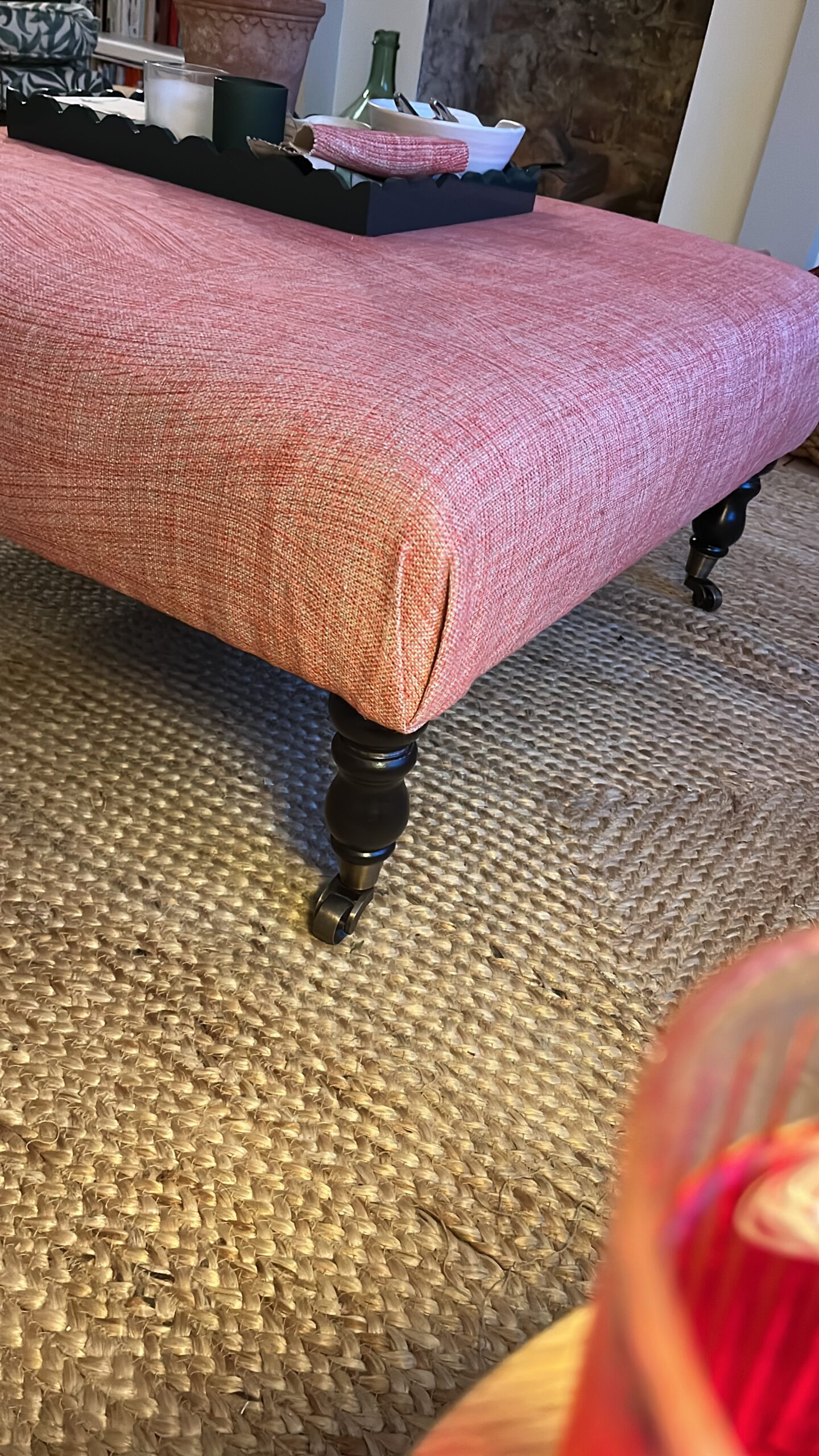
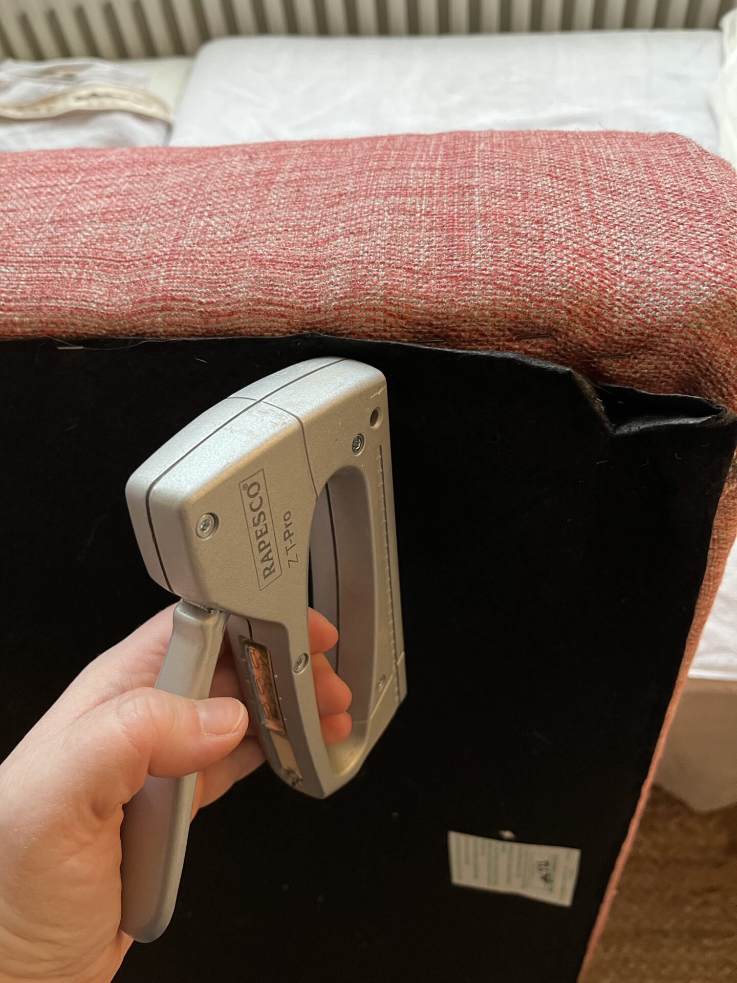
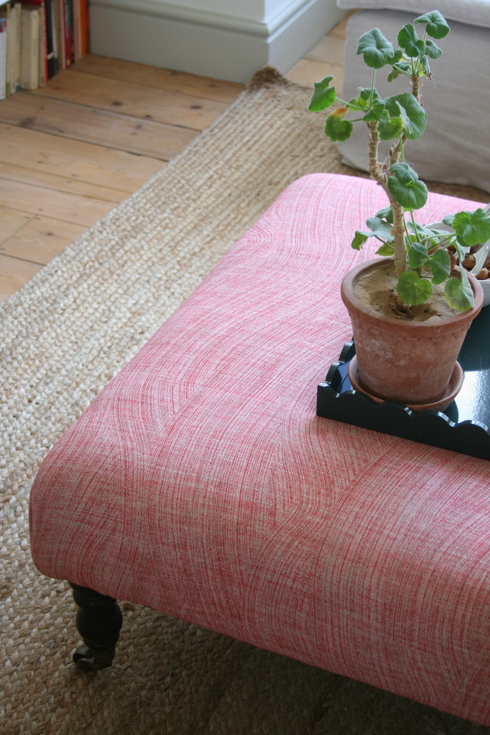
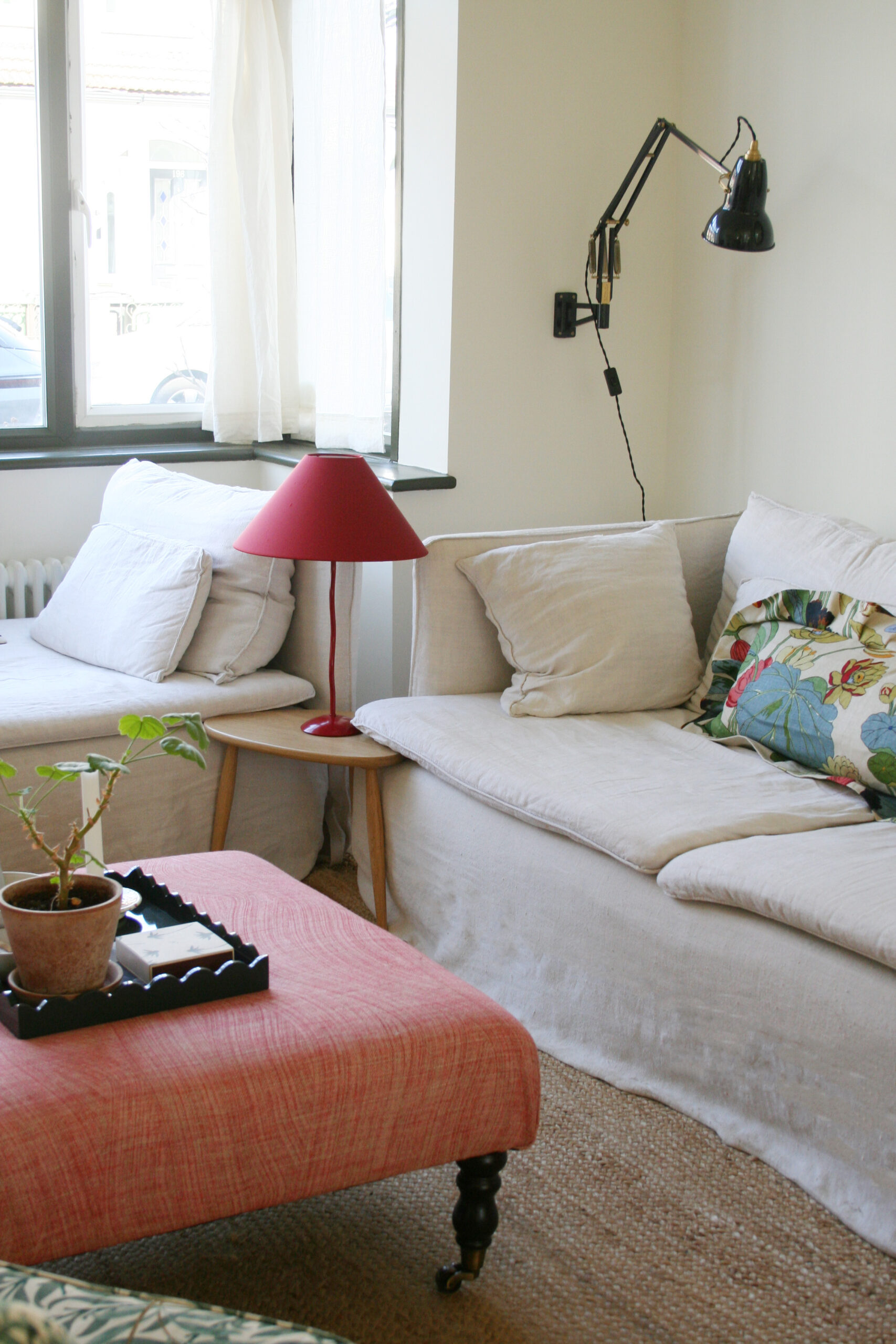
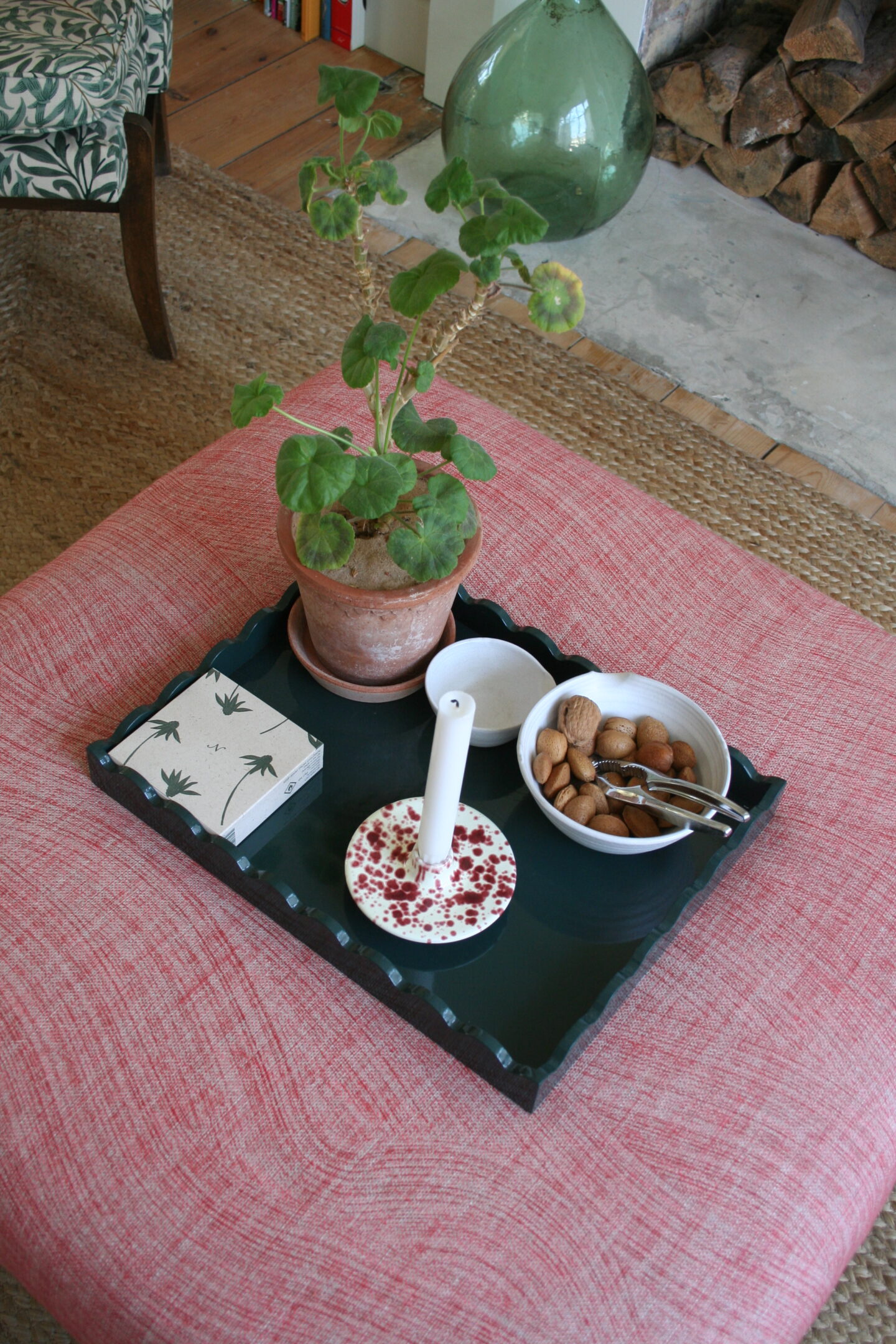
Another big addition was the DIY Fermoie ottoman that I bought second hand and covered myself. It is another lovely soft addition to the space and works in combination with the warm neutrals to make the space more inviting.

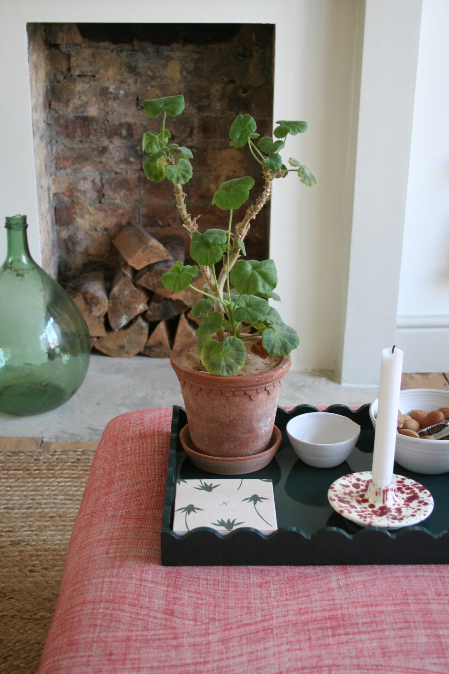
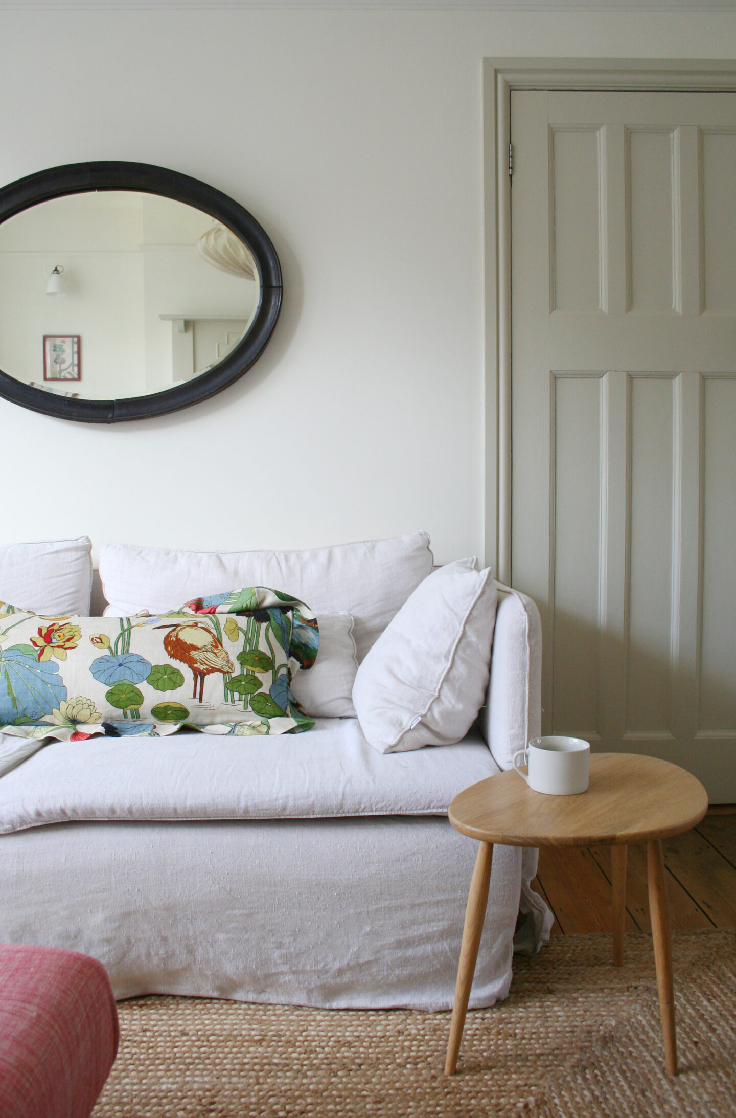
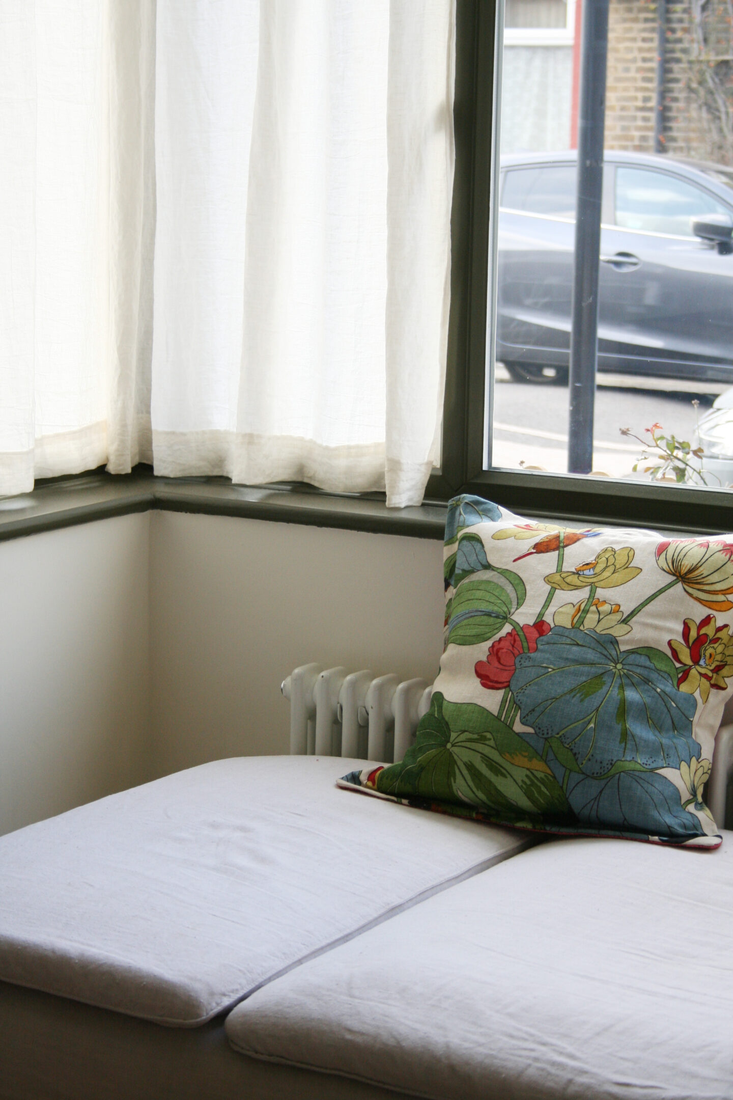
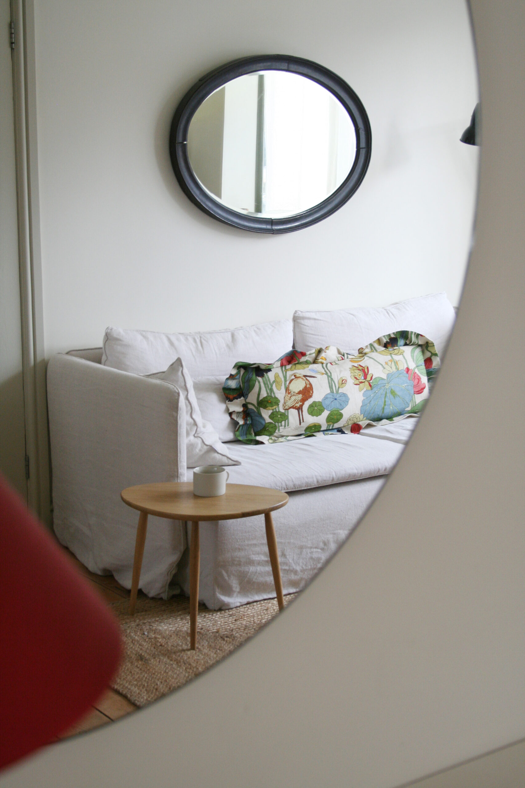
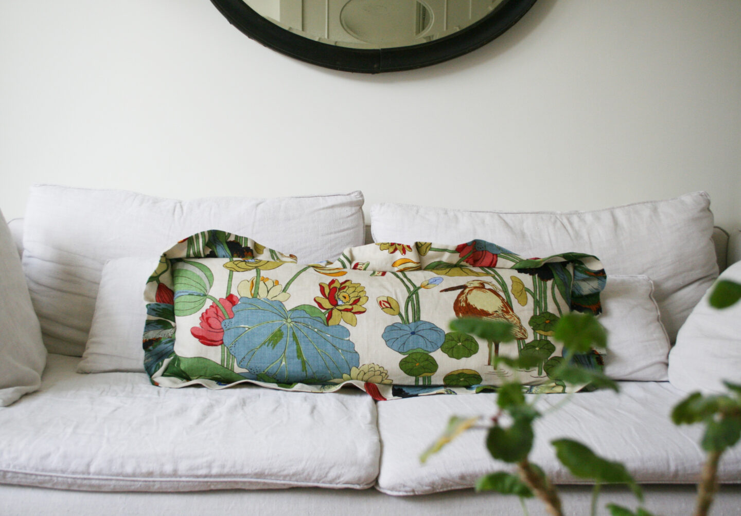
I had my grandmother’s chair re-upholstered for my 40th a couple of years ago in Willow Bough fabric and I wanted that to be a part of this space and it works perfectly with the new paint colours. I then chose a fabric that would work in harmony with the chair, ottoman and curtains to make into cushions. This is one of my all time favourite fabrics and I just LOVE the cushions.

Nympheus fabric by GP&J Baker

I left the cabinet in the corner painted in COAT’s Park Life paint and it’s a really nice way to pull together the green strands that are now running through the textiles in this room.

Cabinet painted in Park Life

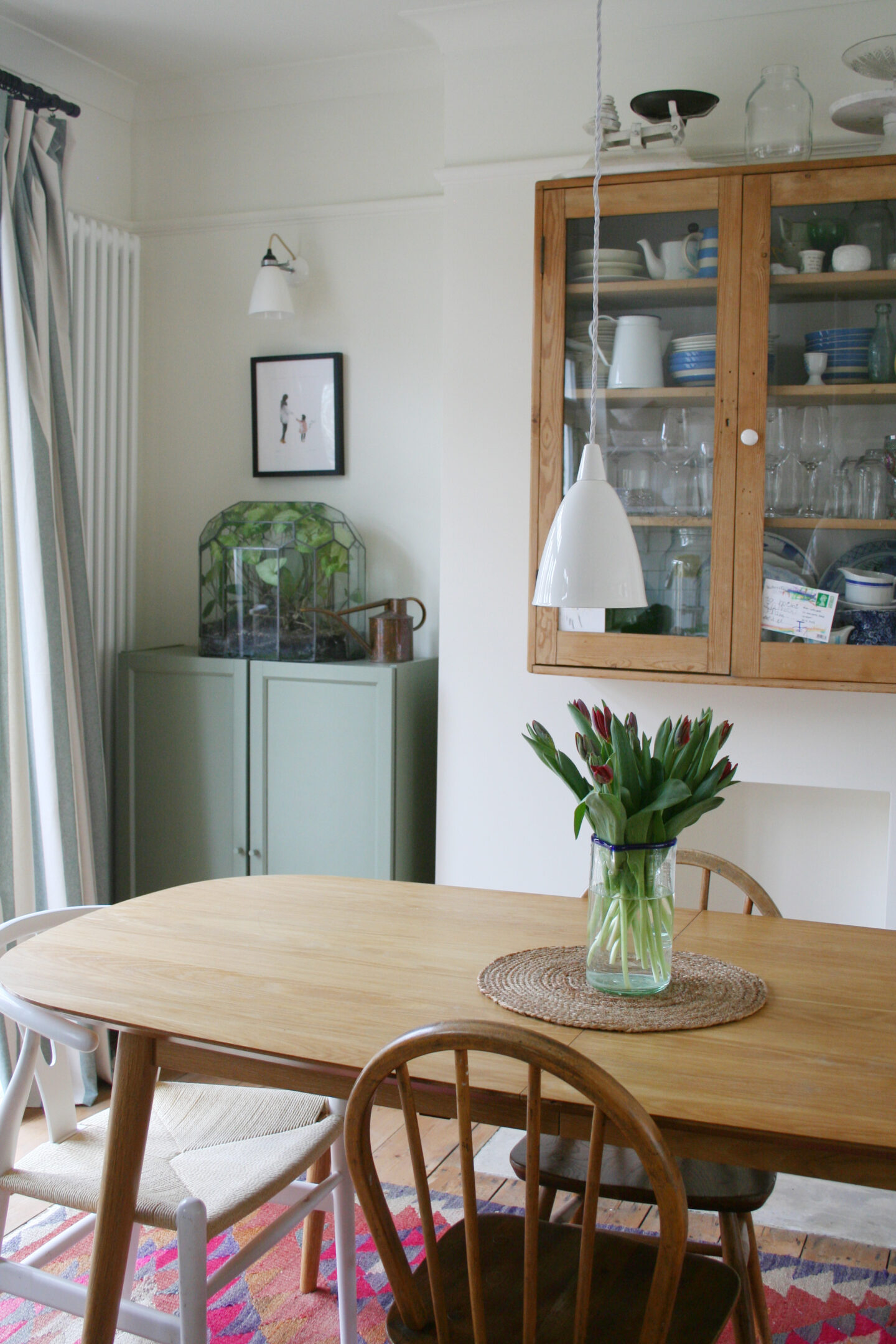
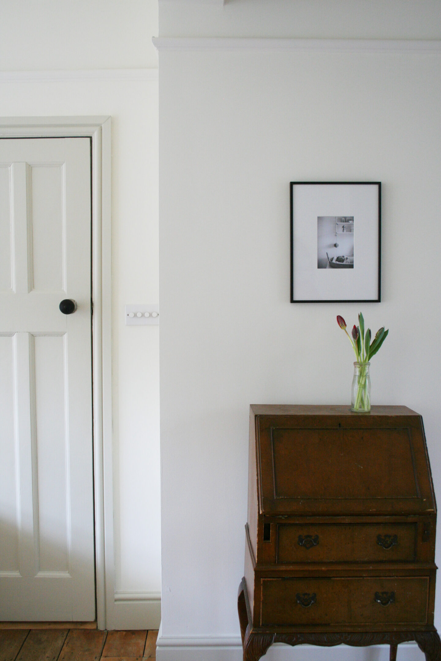
I love the calm vibe these neutrals give to this space and how much better furniture, especially wooden pieces like my little bureau, look against a warm white instead of cold brilliant white.

Cafe Flore on doors and skirting boards.

Another BIG project is to add built-in cupboards and book shelves to the ceiling in the large double alcove below to hide all the six year old’s crafting paraphernalia!

We hope to do some DIY built-in cupboards and bookshelves to hide all the ‘stuff’!

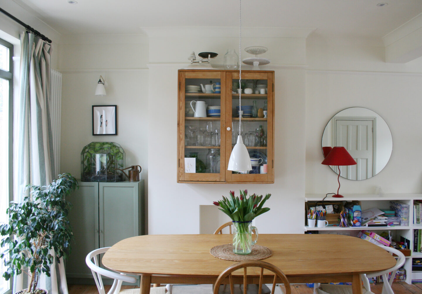
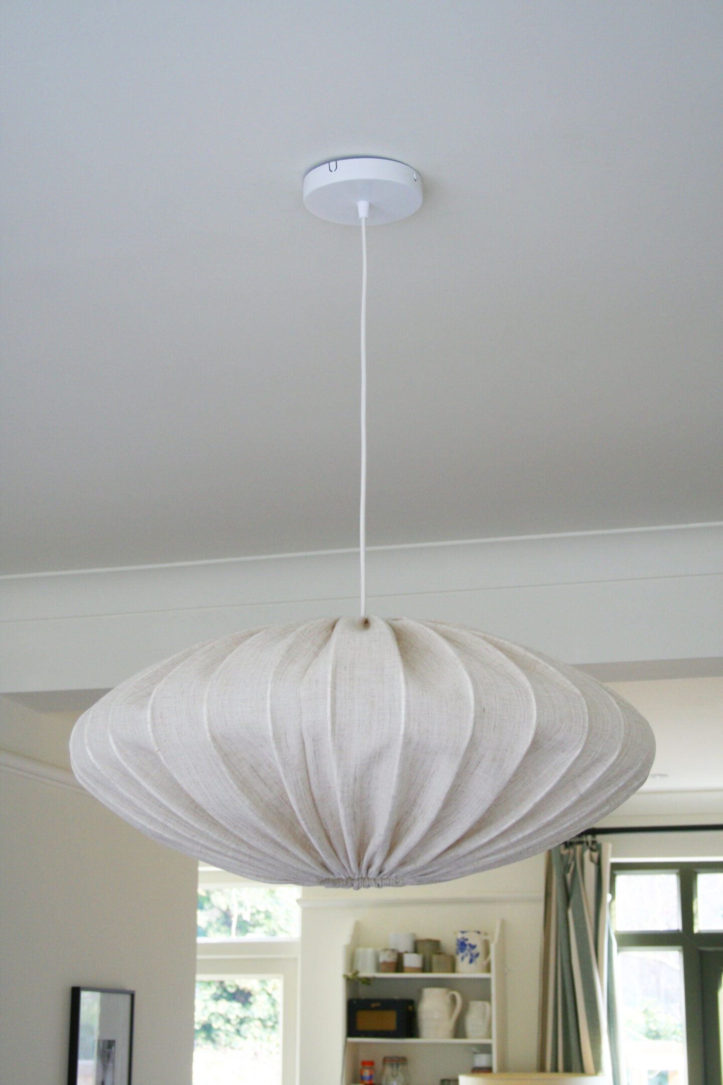
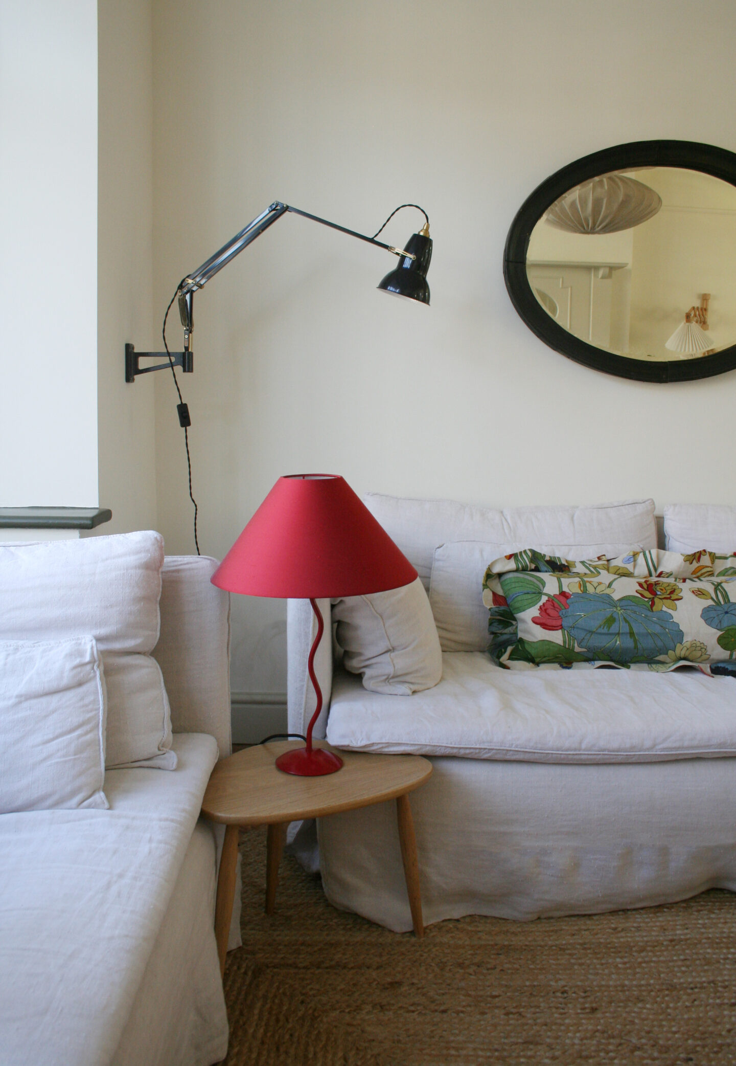
The last addition to the room was a large linen pendant in the sitting room space to help define that space as separate from the dining/kitchen space. It has worked so well for us, with the house the size it is, to have an open plan living room but once we extend I would definitely like to partially close up the sitting room again.

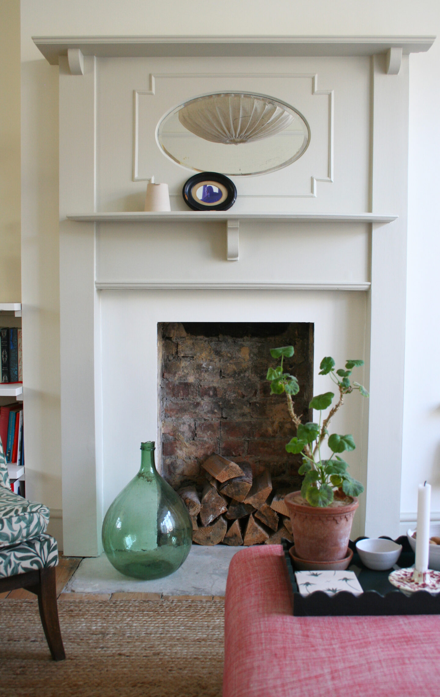
Picking out the doors and woodwork in the darker neutral Cafe Flore has worked really well to emphasise the characterful 1930s doors and fire surround.

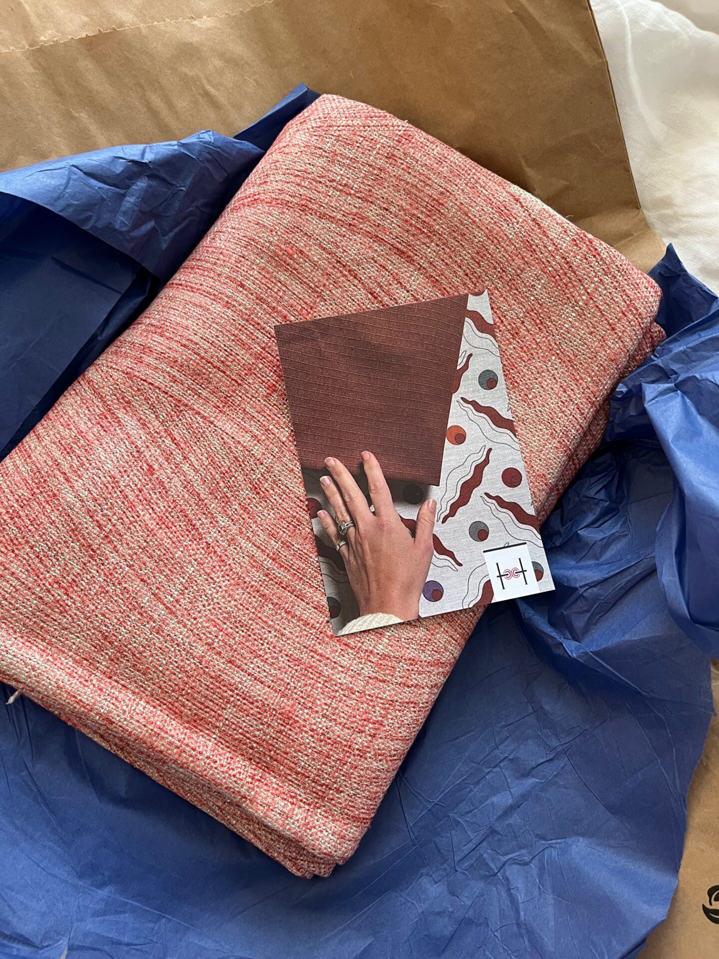
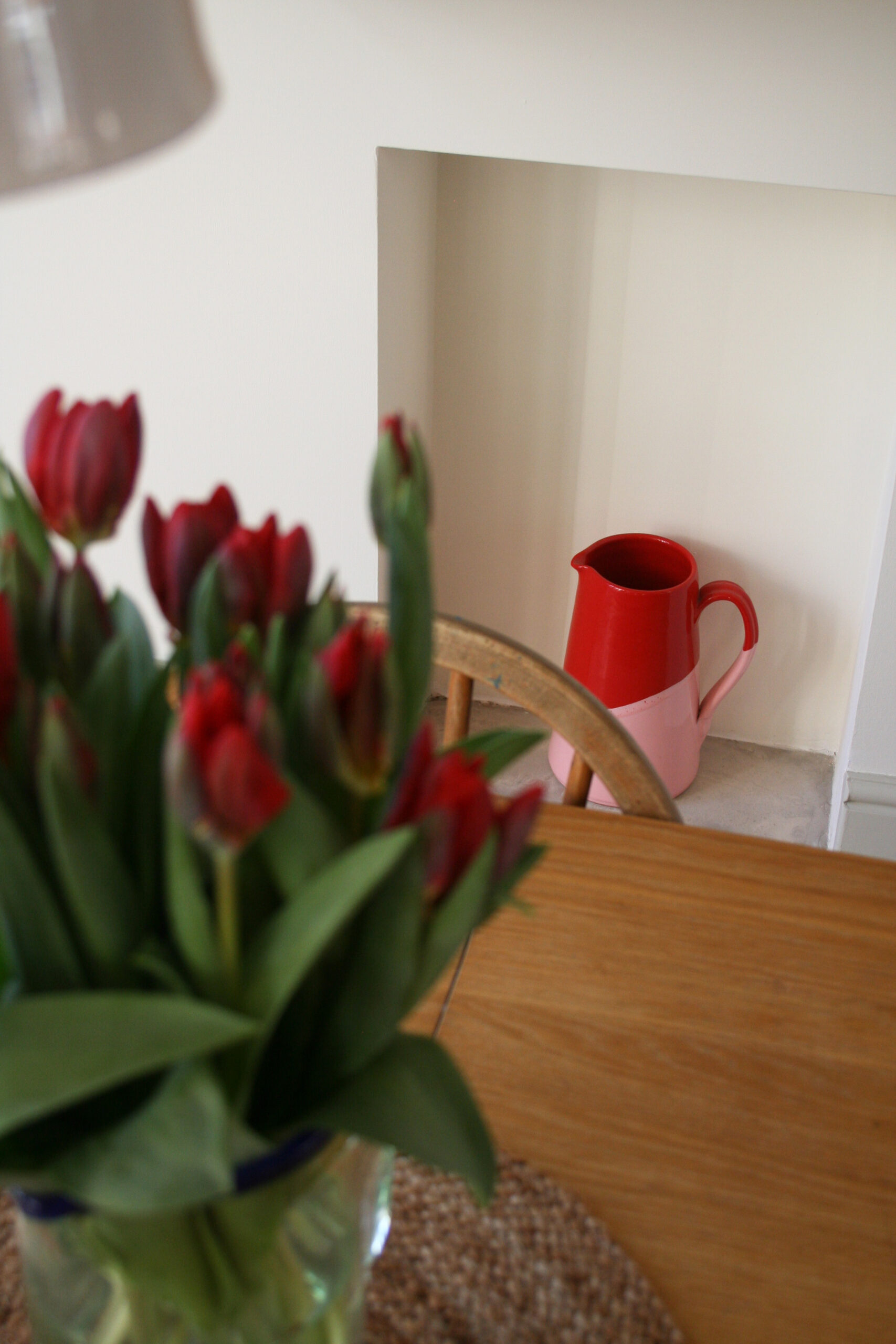
I love the new touches of different tones of red around the room that give a bit of interest and contrast with the neutral walls.

I still need to buy a replacement black handle for the uPVC doors below and I would love to add some mini chequer board tiles on the hearth of this fireplace to continue the thread of the tiles in the hallway: 1930s hallway.

I promise to also do a blog post about how I made this frilled cushion. I sort of made up the pattern myself but I managed to make three big cushion covers from just one metre of the Nympheus fabric so I hope it’s worth sharing how to make the most of some beautiful fabric.

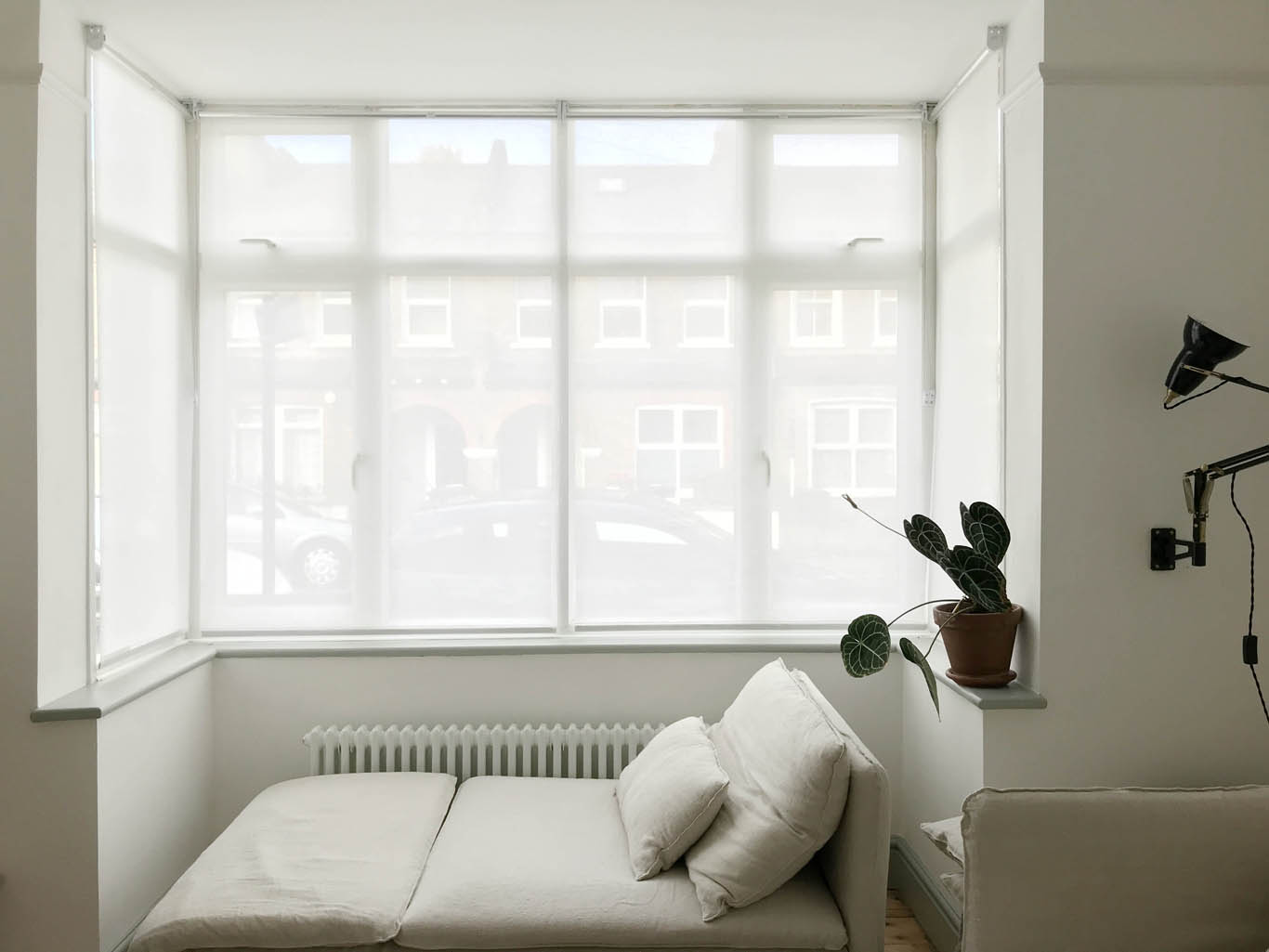
Oh yeh, one more project still remains… roman blinds for the bay window to hang above the cafe curtains: Making cafe curtains for a bay window So, you know, the sitting room is “finished”!

I hope you like the changes to make this space feel warmer, softer and more inviting introducing more greens and reds and less cold blues and whites. I will keep you updated as I add the finishing touches.

Katy x

Source list:

*COAT paints (AD – PR Product) – Walls and ceiling BOOKSTORE, woodwork and fire surround CAFE FLORE, window and door frames THE TOBACCONIST

Linen pendant – Ellipse lamp shade by Watt and Veke

Cushion fabric – Nympheus fabric (pistacio and stone linen)

Fermoie fabric on Ottoman – Haines Collection

Striped curtain fabric – The Cloth Shop

Red wiggle lamp – Bias Editions

Kilim rug – Nain Trading

Jute rug – Dunelm

Danish Scissor lamp

Soderhamn sofas

Bemz linen sofa covers – Simply Linen, unbleached, relaxed fit

DIY Fermoie ottoman

If you follow me on Instagram you will probably be sick of seeing and hearing about this ottoman but I have been pretty pleased with myself because I managed to cover the ottoman as well as sourcing everything second hand. I love an ottoman as I think it fills a room in the same way as a coffee table but it adds more warmth and cosiness as it is soft and squidgy with the added benefit that it can be used as a footstool. I am no upholstery expert, and don’t have any of the pro-tools, but I have recorded some of the basic steps I took to breath new life in to this ottoman that I found on Facebook marketplace for £45 in the hope that it might inspire some of you.

Fermoie Wave 002 fabric covered ottoman

The ottoman was in great condition when I bought it second hand but I really wasn’t keen on the shiny velvet cover. I chose it carefully knowing that I could cover it myself as this type of ottoman involves no sewing or piping or that type of more skilful upholstery.

I really wanted a certain fabric but couldn’t find a remnant of it and it was too expensive to buy especially as I needed just over one metre so would have to order two. Therefore, I snapped up a remnant that was the perfect size from the Haines Collection – a company that works really hard to reduce waste in the interiors industry by selling end of roll/ex-display/unwanted fabric that would otherwise end up in landfill – and although it isn’t the perfect colour that I wanted it still works really well and the texture makes it perfect for a room that a big dog walks around.

This Fermoie fabric remnant from the Haines Collection was the ideal size and a fraction of the price it would have cost me to buy the fabric ‘new’.

The first job was to remove the old fabric from the ottoman, without ruining or completely removing, the bottom fabric (the black fabric). There was absolutely nothing wrong with the bottom fabric so I could simply reattach it but if you need to buy some you can do so here.

I unscrewed the legs and began removing the staples with a screwdriver and pliers. If you don’t want blisters by the end of it I would recommend a proper staple remover but I really wanted to do this with what I had and it worked.

After removing millions of staples I eventually got the black bottom fabric and the top fabric off. The foam and webbing were both in perfect condition so I left those but I would recommend e.foam if you need foam cut to size.

My fabric was basically exactly the right size for this ottoman so I didn’t need to cut much away but I placed the ottoman in the centre of the fabric to help figure out how much did need cutting away and very importantly for different shaped projects/fabrics to figure out which way the pattern would run. You can see the black bottom fabric is still attached but that’s only because the feet were screwed into it so I just worked around it (all the staples had been removed). I stapled the Fermoie fabric in place using just a couple of staples on each side working out from the middle. This helped me figure out whether the fabric was in the correct place and that I wasn’t pulling the fabric too taut or that it was too loose.

Once I was happy with the tension and placement of the fabric I stapled the fabric in the place working out to the corners. Once at the corners I had two choices: either pull out the fabric and do a straight square corner (as above) or a do a pleat (as below). I prefer the look of a pleat so I chose that way of doing it.

Doing a neat corner is actually much easier than it looks and just takes a bit of trial and error. All you have to do is pull the fabric taut over the corner and fold in either side and attach with staples on the bottom. I did have to cut away some of the fabric from the corners as it became too bulky.

Once I had attached all of the Fermoie fabric into place with my staple gun, I did the same with the bottom fabric, which basically just gives a nice finish and covers all of the tatty edges. I use this Rapesco staple gun, the same one I’ve been using since I was a teacher for my display boards, and I used long staples – 53/8mm – which is important to keep the fabric in place. This isn’t the ideal tool as it isn’t as strong and the staples aren’t as long or tough as the gun a professional would use but this isn’t going to be clambered on etc.

I really love the way the wave form of the print flows over the ottoman – it’s really quite mesmerising to look at.

I hope you like it and that this post is helpful for anyone looking to do the same.

Katy x

Painting internal uPVC window frames

Happy new year, friends! I hope you have all had a lovely break and feeling ready to take on 2023. I think I can count on one hand how many blog posts I wrote in 2022 but I hope to do a lot more this year, especially whilst I am studying at KLC School of Design until the summer. I spent my Christmas break painting our living room so be prepared for a few updates on here, starting with the windows…

I have spent a long four years staring at the horrible plastic window frames and doors in our living room. We inherited all of them and they would never be our first choice but they are very practical, do not need replacing and we definitely do not have the budget to replace them. Therefore, I decided at the end of last year, whilst I had a break from college, it was about time that I gave them a little glow up.

I have long been a proponent of painting uPVC since we did our front door the first year we moved to the house. It has withstood so much battering, dog claw scraping, scooter bumping so I know it is a good long term solution. My experience of using Ronseal’s All Purpose Primer on the front door has been nothing but positive (I collaborated with them on that project) so they were my first port of call for this new project. I asked them to send me a new tin of the primer and it has worked a treat, again!

As with most painting projects preparation is absolutely key and definitely will take the majority of the time. Once the cleaning, sanding and priming is done, the painting itself is pretty easy. And I hope you agree it is well worth the effort. For me, one of the biggest benefits of painting uPVC is getting rid of the shiny plastic so whatever colour you choose just applying paint makes it look better and gives it more of a feel of painted timber. However, my advice to you is to choose a dark colour if you really want to make it look less like uPVC as this is what disguises the tell tale chunky plastic frames and unpleasant joints. The shadows created by the block like frames disappear with dark paint and it all looks much more cohesive.

Anyhoo, here are the simple steps to painting uPVC – DO NOT skip any of these as there’s only one thing worse than plastic frames and that is chipped painted plastic frames.

You will need:

Primer, cloth, 120 grit sandpaper, eggshell topcoat, paint brush, mini roller, paint scraper.

I have used:

Ronseal All Purpose Primer (PR Product)

The Tobacconist eggshell

Paint scraper (I wouldn’t recommend this as a great product – it works but I worry the blade blunts very easily. It was what I had so I used it but you can get better alternatives.)

  1. Choose a mild day that isn’t too hot, too cold or wet so that you can leave your windows/doors open (I did mine in the middle of the cold snap so I couldn’t open the windows so I still haven’t finished parts of them).
  2. Wash down the plastic really thoroughly and dry off.
  3. Lightly sand every part of the frames that you plan paint. Use 120 grit. Hoover the frames to remove all sanding dust.
  4. Apply one thin, even coat of primer with a brush ensuring you cover every part of the frames but don’t heap it on. Don’t worry about taping the windows, you can paint primer onto the glass itself as it will scrape off very easily at the end. Technically, you can paint over the primer in four hours but leaving it to dry overnight is better in my book (this is not a job you can get done in a day).
  5. Choose an eggshell paint that is intended for interior wood or metal for your topcoat. To all intents and purposes the primer turns your plastic surface into a wood surface so you now can paint your frames as though they are timber. Apply a very thin first coat of eggshell with a small soft brush – the patchier the better! You want to build up two or three thin coats to give it a nice strong finish. I leave each coat to dry overnight and then it needs a few days to completely dry before you can put things on window sills etc. Again, don’t worry about the paint going on the glass as this will easily scrape off and you will get a much better finish by painting all the way to the edge of each frame and onto the glass than taping the windows will give you. Also, a mini foam roller will be your best friend to give a lovely even coat but don’t be scared of brush strokes – they make it look even less like plastic!
  6. Use a paint scraper to remove the excess paint on the glass – you should end up with a really neat finish this way.
  7. Replace hardware to improve the overall looks of the windows. UPVC require specialist handles/locks as the lock mechanism is different. Try The Door Handle Company for some really good options.

I’m really thrilled with the topcoat colour that I’ve chosen, The Tobacconist, which is a very dark bronzey green. It has none of the harshness of black or graphite as it’s full of warm bronze undertones. Also, because it is a very dark colour it helps to blur the lines between all the joins and layers of plastic to make the windows and French doors more streamline.

I need to replace the handle to the door and I need to finish the new curtains I am making but this really feels so, so different.

What we inherited…

Look forward to showing you more of the room now that I have nearly finished giving it a makeover.

Katy x

Making cafe curtains for a bay window

When we first moved in to our house nearly four years ago the first thing we did was put up two sheer blinds we had brought from our flat and bought two more for the big bay window in our sitting room that overlooks the street. Our road is a dead end with the entrance to a park so although there is no traffic there’s quite a lot of footfall and every other person turns to look in through the window so some privacy felt much needed. However, the blinds were always meant to be an interim measure for a few reasons: 1) I find them quite sterile and cold feeling 2) If you want privacy they have to be pulled all the way down and I dislike not being able to see any of the window or the sky 3) They are completely opaque during the day but not at night – they only offer a soft blur once the lights go on in the evenings.

I’m sure there are a lot of people in a similar boat who live on a terraced street with minimal front garden so I hope you find this post helpful as I think cafe curtains are a really great solution to the problem of wanting to allow in light whilst still having privacy. The thing I like most about cafe curtains is the fact that they are hung across the window so that I can still see sky. This makes the room feel so much more open and the quality of light when the curtains are drawn is much nicer as natural light is mixed with the diffused light that comes in through the curtains. The other big bonus is that I used curtain rings so that I can draw them completely if I want to, which I do do most days as I actually really like being able to look out especially when I’m working at the dining table during the day. I hated the dull diffused light of the sheer blinds that were almost always pulled all the way down as rolling four blinds up and down was a pain.

These were the blinds we put up as an interim measure (nearly four years ago!!). They were cold and sterile and gave total privacy during the day but none at night. These are John Lewis’s Sheer Blinds.
I much prefer being able to see the sky above the curtains and the softness the fabric adds to the window. I will hang Roman blinds at the top of the window eventually.

I chose the fabric of the curtains very carefully and it required a lot of fabric samples as I needed the curtains to allow lots of light in whilst being opaque at night. Ultimately we will have a set of Roman blinds over the cafe curtains for the evenings but I know that may take a while as they’re expensive therefore my priority was finding a fabric that would give us complete privacy in the evenings. I found a linen from Merchant and Mills that ticked all the boxes and wasn’t too pricey and although not the prettiest linen I was happy to compromise for the other important qualities. The fabric is Tumbled Linen Warm White and I bought 5 metres for my window. The sewing job is an easy one it’s just awkward as the pieces of fabric are so large so unless you have a full size sewing table it’s tricky cutting to size. But other than that it’s just a case of hemming the fabric once you have decided whether you want gathered curtains or a more simple panel. I decided to go for fitted panels as I knew I would want to draw the curtains on a daily basis so I didn’t want too much fabric gathered at the side of each window. One tip I would pass on is to wash the fabric before making the curtains as linen will shrink so your perfectly fitted panels will no longer be perfectly fitted after a wash.

I bought curtain poles from East London Cloth as they are lovely and slim and the brackets fit my square window perfectly, which is very tricky to find. I chose the least expensive brass cafe curtain pole and I’m really happy with them – do go and have a look at the site for some beautiful cafe curtain inspiration. East London Cloth also sell beautiful linen curtains or fabric by the metre if your budget is bigger than mine. I teamed the poles with some very inexpensive antique brass curtain rings so that I can draw the curtains really easily and the combo works brilliantly. I have four rings for each 50cm side panel and eight rings for each 120cm middle panel.

Our windows are uPVC and they were in the house when we bought it. They wouldn’t be my choice but they are in really good condition and work extremely well so for now I want to make the best of them. I was happy to screw the curtain poles straight into the plastic as I know this will be a very long term window treatment and I will be painting the window frames green very soon, which will make the curtains look even better. If you are interested in painting uPVC have a look at my previous blog post Painting a uPVC Front Door.

I hope this is useful – do let me know if you have any questions.

Katy x

The finished IKEA PAX hack wardrobes

As promised, here are pictures of our PAX wardrobes now they have been hacked and painted. If you missed it I shared how we hacked our PAX wardrobes last week and although it was a long process for us – mostly because we customised the door fronts – it has been so worth it.

The concern most people have when they opt for built-in wardrobes is losing a sense of space. However, I would say the opposite is actually true. When you add free standing furniture to a room, especially in a small room, it is the gaps between the furniture and the walls that they stand against that can make a room feel disjointed and cramped. For example, when we had built the wardrobes and had not started the boxing in process the room felt a lot smaller suddenly. This was because the gaps between the sides of the wardrobes and the alcove walls as well as the tops of the wardrobes and the ceiling created horrible gaps and resulting shadows that made the room suddenly feel higgledy piggledy and as I looked around the room my eye just didn’t know what to look at first as there were so many awkward shapes and lines. The moment they were boxed in the room felt calm and cohesive again.

I chose to paint the wardrobes Shaded White, which is ever so slightly darker than the School House White on the walls. It allows the wardrobes to disappear into the walls but the slightly darker tone provides just enough contrast. I just LOVE how light and calm this room is now. When I come into the room it is like walking into a big dreamy cloud. The black fireplace, Inchyra Blue door (when open from the hallway) and a few dots of colour from cushions, plants and the Jitney woodwork are just enough points of contrast for all the neutral paintwork.

I chose to add the corner cupboard rather than having two alcove wardrobes as I really wanted as much storage as possible. Yes, I could have had a a chest of drawers or dressing table along that wall instead but in such a small room it would have been impossible to fill this space with anything that gives me as much storage as the PAX does.

We are so pleased with how the cupboards have turned out. Believe it or not we still haven’t fully organised the interiors so I will have to show you those at a slightly later date when they are finished (quite a lot of just stuffing things in is the current situation. But for those of you wondering, the first cupboard on the left is a shelf with a mirror that acts as a dressing table area with drawers below it for makeup and drawers for underwear. The second cupboard is forward facing hanging, the third cupboard is half shelves and half drawers and then the cupboard in the alcove, which is the deepest is all hanging with high shelves at the top. I will show all soon but it is amazing what it can fit!

I’m very pleased with how little floor space the cupboards take up as we were able to to choose 35cm depth frames for the left hand wall so when I enter the room the cupboards do not feel obstructive.

The big issue I was left with covering so much wall space with the wardrobes and not having any other furniture in the room besides bedside tables was the lighting. I had always had a lamp in the alcove, which combined with the two low hanging pendants over the bedside tables was a perfect amount of light for this small room where I never ever need overhead lights. Therefore, I had to consider wall lights on the chimney breast but this would be a big expense for the light fittings and getting them wired in. So I decided a good option would be to find a small lamp to sit on the very shallow fire surround – a pretty difficult challenge, I can tell you. I did find one from John Lewis (they no longer sell it unfortunately) that fits perfectly as it has an irregular sized shade and luckily I love it, especially the plum coloured base. It was only £55 so this was definitely the least expensive way of dealing with the issue as well as the least hassle and it emits the perfect amount of light for the room. We took a hole out of the side of the wardrobe frame and box so we could plug it in where we have an existing plug hole in the alcove (we made sure all of our plug sockets are exposed by cutting our notches in the cupboard frames).

Jules’s cupboard is on the right side of the room and fits into the alcove but is only 35cm deep as there is so little space between the cupboard and the end of the bed. Jules was concerned that having no symmetry between the two sets of cupboards would look strange but it really isn’t a problem, in my opinion because of the colours we have used. Yes, one set of cupboards is deeper than the other, neither set are central within the alcove and the left hand set has a massive 15cm gap that required boxing in but I really think the boxing in process has smoothed out all of those differences and has made it all look very cohesive.

I took these photos on a very dull day and just as I had finished the sun came out and poured into the room so i took a pic of the the window and I think this gives you a really good sense of just how small the room is.

We’re super pleased and I will follow up with more about the interiors and costs!

Katy x